40 Times Architects Really Outdid Themselves And Deserved To Be Celebrated On This Instagram Page
Architecture is a complex art. It requires lots of creativity to make the structures sound, as well as functional and visually appealing at the same time. This is in no way an easy task, yet some people thrive on the challenge; and they introduce to the world some of the most spectacular designs one can find.
And luckily for us, they are found by Architecture Hunter, a digital content platform that sheds light on some of the most impressive ideas and projects out there. What started as an Instagram account sharing visuals of awe-inspiring architecture grew to become a multi-platform undertaking with millions of followers and viewers online.
“Inspire, inform and entertain,” reads their mission statement, and you’re about to see why. Scroll down to find some of the most exceptional designs shared by Architecture Hunter and learn who were the masterminds of the unique concepts.
If these images have captured your attention, make sure to browse Bored Panda’s previous posts about excellent architecture here, here, and here.
More info: Instagram | Youtube | TikTok | Twitter | Pinterest
This post may include affiliate links.
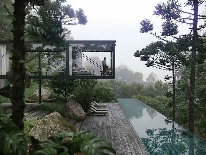
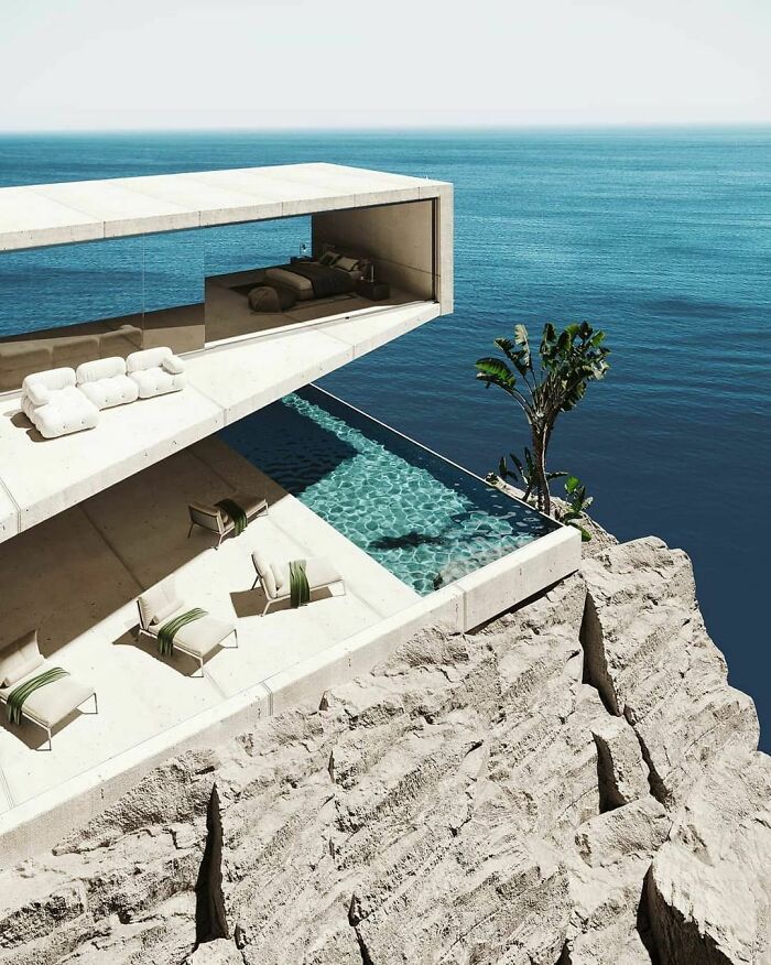
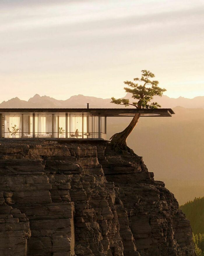
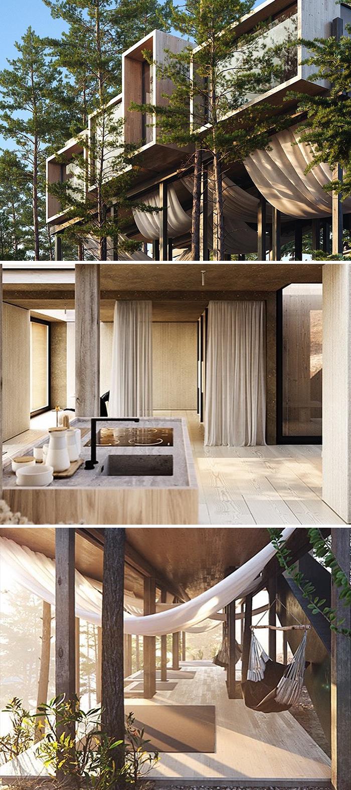
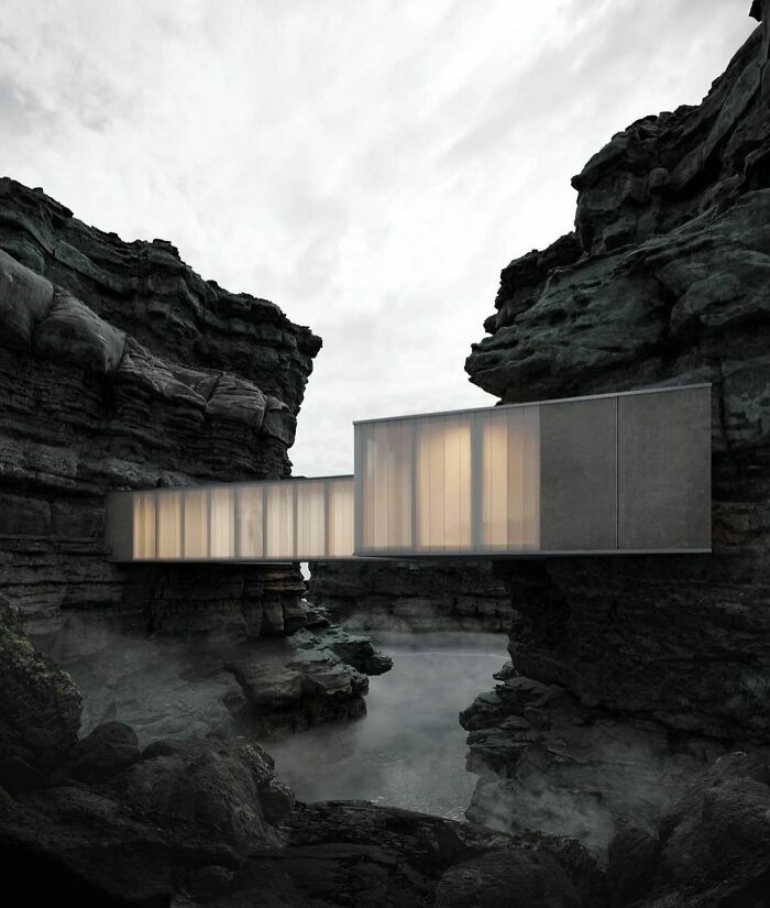
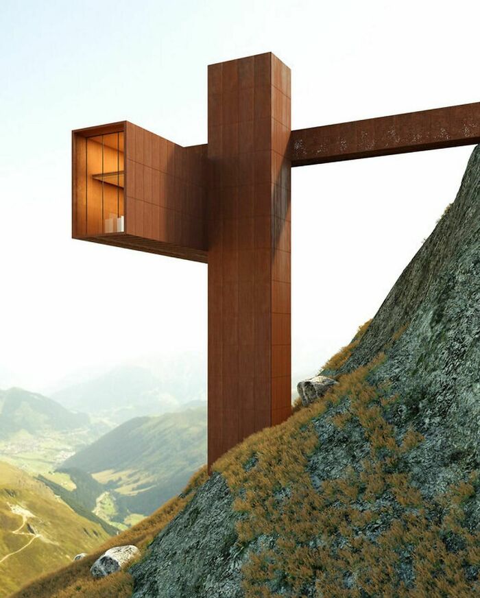
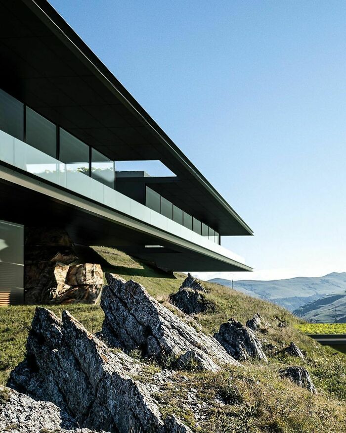
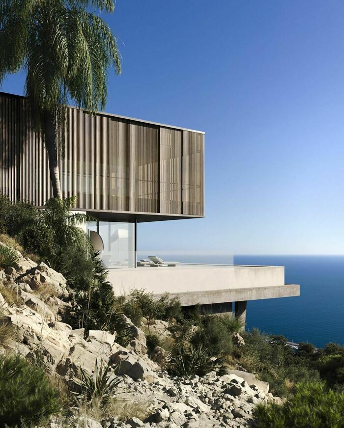
This incredible house, with a great cantilever, was designed by Alessandro Giraldi & Marcelo Moura.
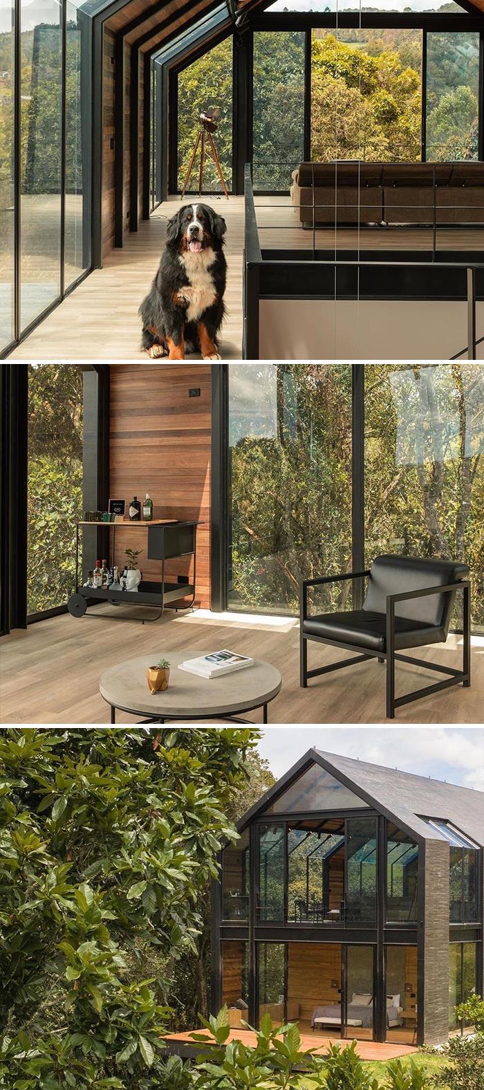
Casa Oliveira, designed by A5 - Arquitectura, and with an interior design project by Adrede Diseño, is located in Medellin, Colombia.
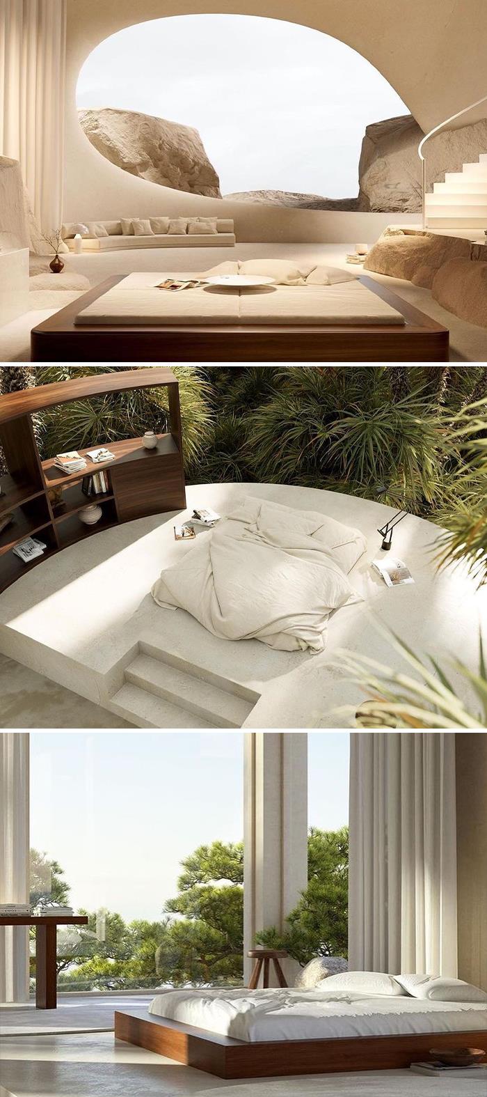
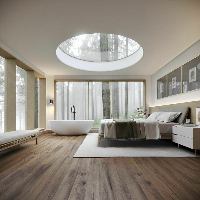
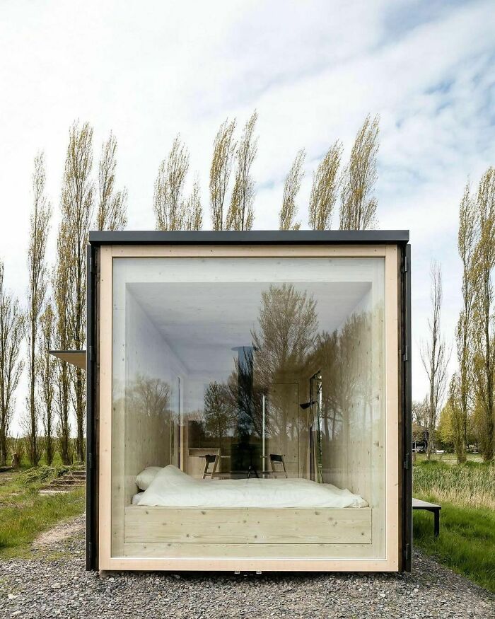
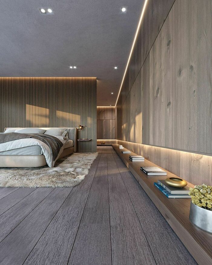
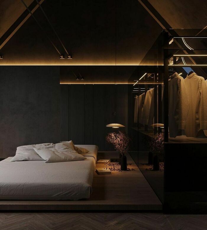
Which Sebastien Baert's bedroom concept do you like the most?
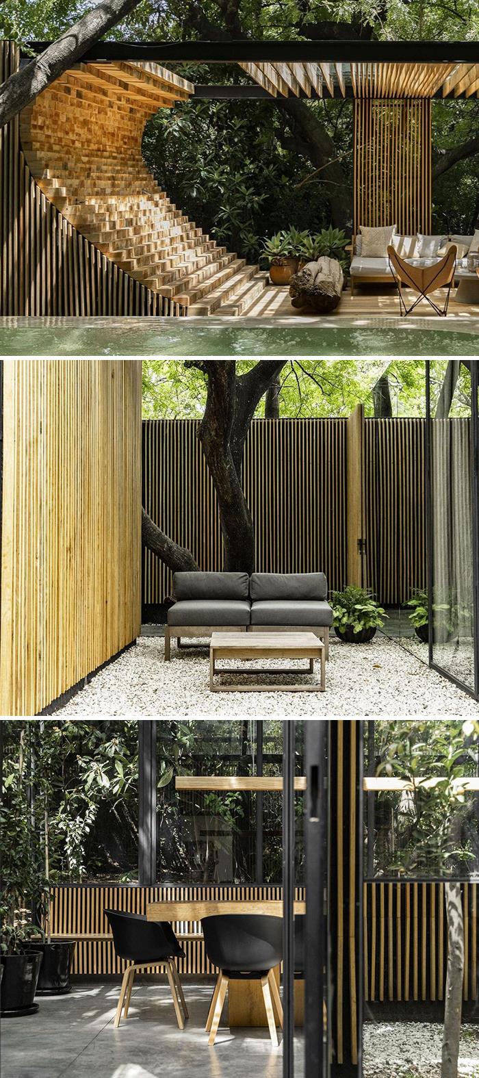
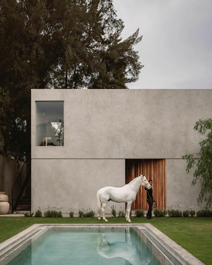
Project: UC House
Architecture: Daniela Bucio Sistos
Photographer: Dane Alonso & Mariano Renteria Garnica
Location: Morelia, Mexico.
“The architectural design arises from the concern to create a project with certain spatial ambiguity between the interior and exterior and that could sometimes be imperceptible. The UC project is a residence in which all the interior spaces are in direct contact with the micro-environments generated inside the house. The project was always thought of as a walkable residence, that when walking through it, the change of textures and scales would make it space away from the ocularcentrism and more linked to a sensitive interaction with the user. Contemplative and silent spaces” say the architects.
Designed and visualized by Federico Repetto.
Kinda looks like if the tree falls it'll take the house with it
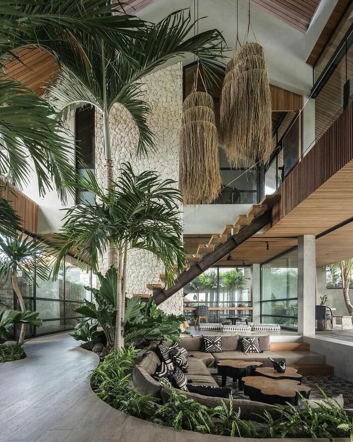
Designed by Biombo Architects and photographed by KIE. Cala Saona is located in the heart of Canggu, Bali, Indonesia, on a plot that is facing sunset and surrounded by stunning rice fields. The Villa has 5 bedroom en-suite for the main family building and then, taking advantage of the natural slope of the plot, the architects created in another level under the pool, a guest pavilion named “Batukaru Suites” with another 3 bedroom en-suite, all with individual and private pools and terrace.
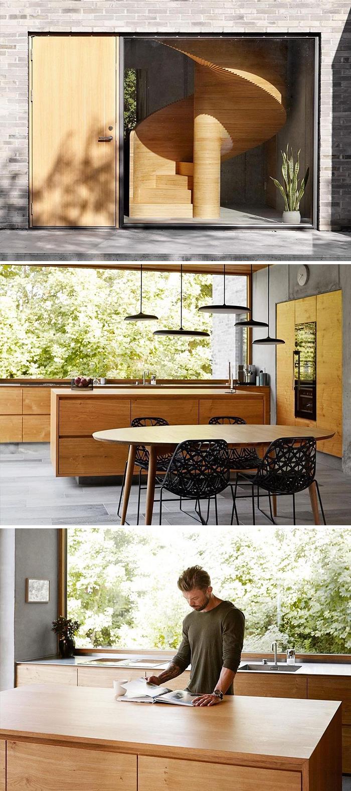
Designed by Tommy Rand and photographed by Mia Mortensen.
This house in Aarhaus, Denmark, was built for the architect himself. The wooden helical staircase in light tones contrast with the slate on the facade, bringing this project an elegant and minimal look.
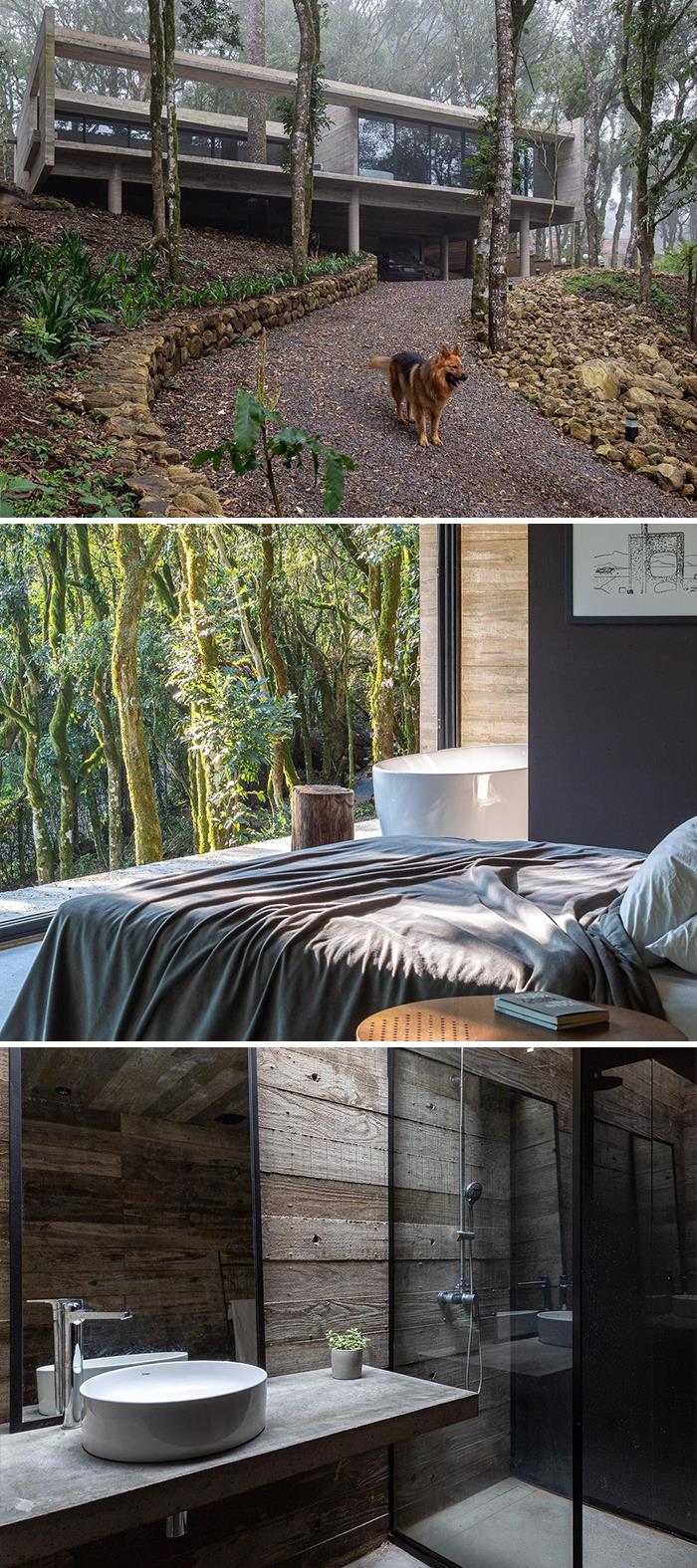
Designed by Luciano L. Basso and photographed by Manuel Sá, Casa Fortunata, located in Caxias do Sul, Brazil, is a perfect example of integration between nature and architecture.
“Regarding the designed forms, the geometry simply rests on the ground. We designed a silent architecture that maintains a frank dialogue with nature; either through its opaque walls that in the harsh southern winter are confused with the fog; either because of the way that the forest is reflected in its glasses in the days of blue sky” tell the architects.
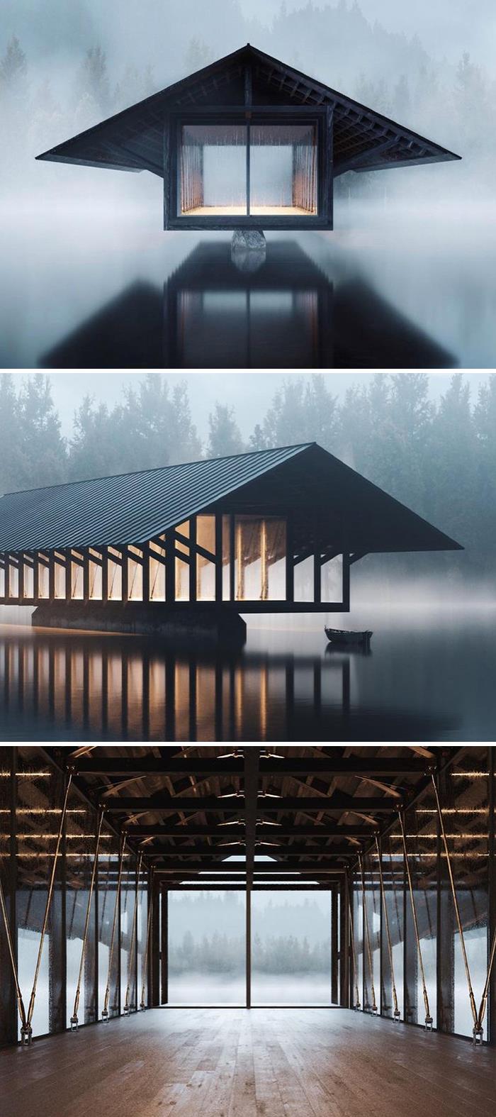
Project: Crystal Lake Pavilion
Architecture: Marc Thorpe Design
Renders: Truetopia
Location: Roscoe, NY, USA
Here is what the designers have to say about the project: “The Crystal Lake Pavilion is designed to be used for meditation and yoga classes as well as group therapy. The pavilion is a site-specific work, embracing the surrounding natural environment through its all glass skin and structural transparency”
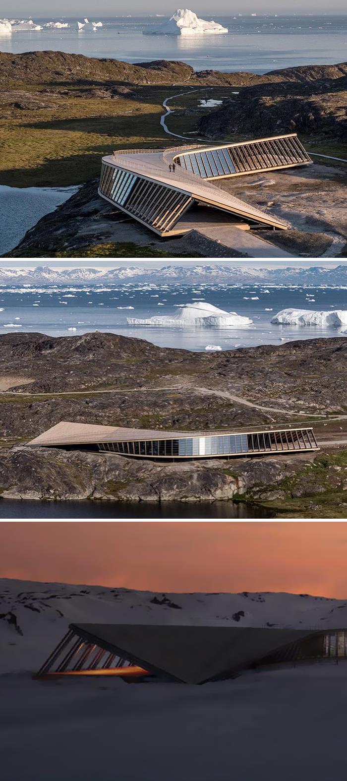
Project: Ilulissat Icefjord Centre
Architecture: Dorte Mandrup
Photographer: Adam Mørk
Location: Sermeq Kujalleq Glacier, Greenland.
“The UNESCO-protected Icefjord area carries 4,000 years of cultural heritage and is essential for understanding the climate crisis. An understanding, the Icefjord Centre aims to support. The aerodynamic form is now visible in the landscape, where it is designed to minimize snow build-up while framing the views towards to fjord. The curved form is created by geometrical different steel frames, creating a double-curved roof. The framework of the building is covered by a gently sloping, curved wooden boardwalk. It embodies the starting point of the World Heritage Trail and acts as a gathering point, informal seating area, and a viewing platform – offering a spectacular, undisturbed view of the Sermermiut Valley and the Icefjord” say the architects.
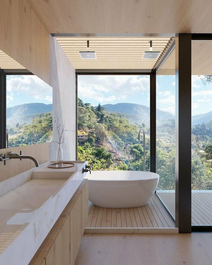
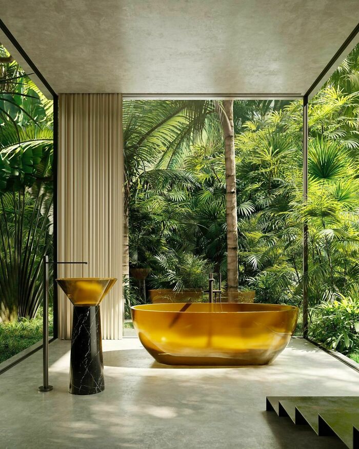
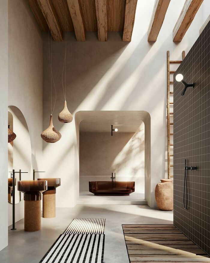
Fascinating products by antoniolupi. The flourishing landscape grows in the most intimate spaces of the house and the transparency of the Cristalmood projects the objects into the forest. Boundaries dissolve, indoor and outdoor compenetrate in a delicate game of reflections, shadows and materiality that reconnect us with Nature as a primordial and generating force. Albume freestanding washbasin in Grancru Cristalmood and neromarquinia marble by Carlo Colombo. Reflex bathtub in Gran Cru Cristalmood by AL Studio.
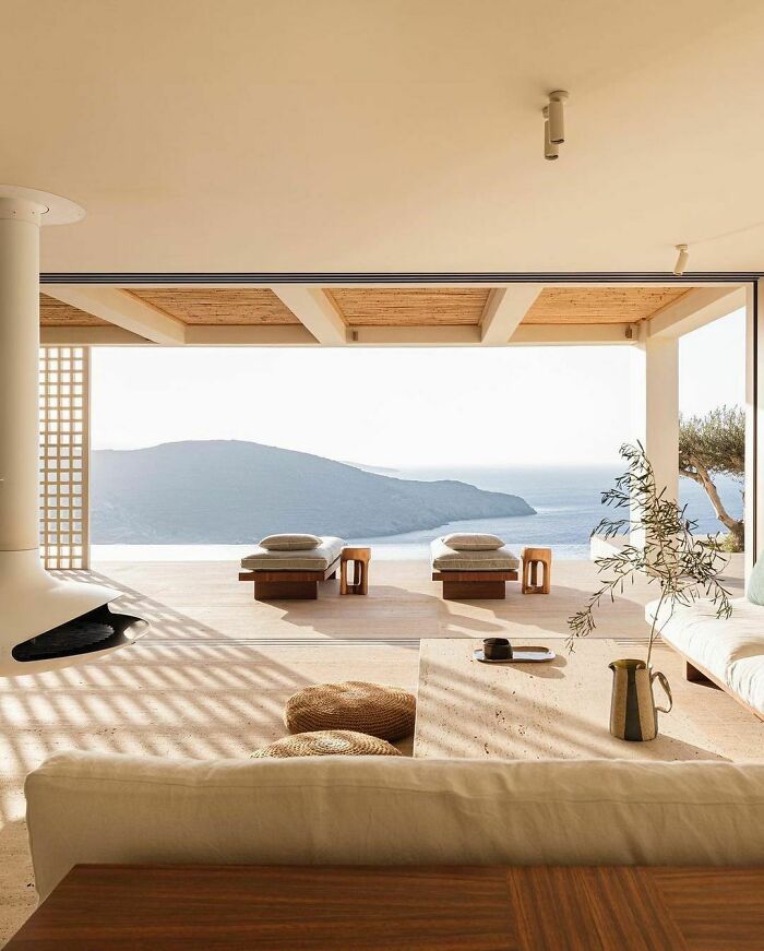
Location: Tinos, Greece.
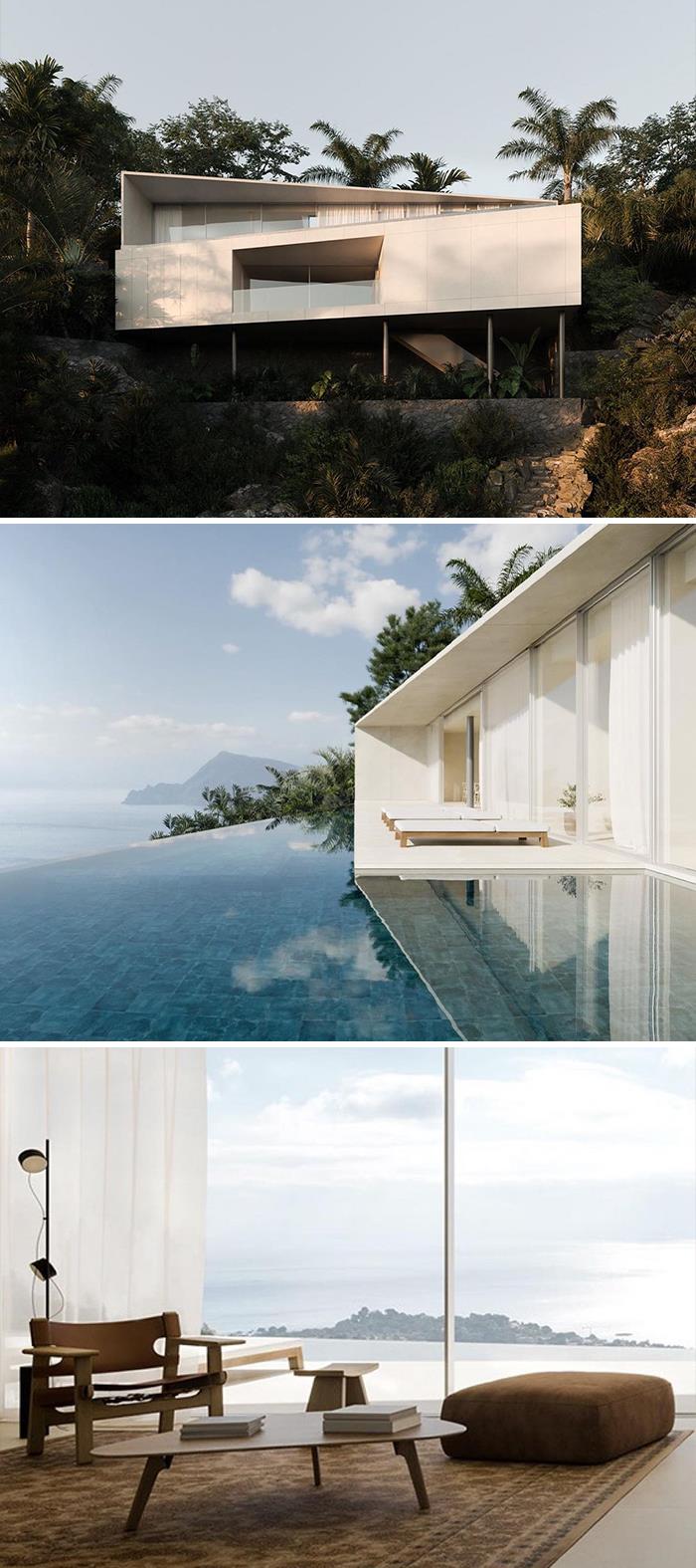
Project: La Khaima
Architecture: JUNCO ARQUITECTURA
Visualization: PIX
Location: Altea, Spain
The simplicity of the house forms inserted into the nature, make the trees, landscape and views be the protagonist of the project.
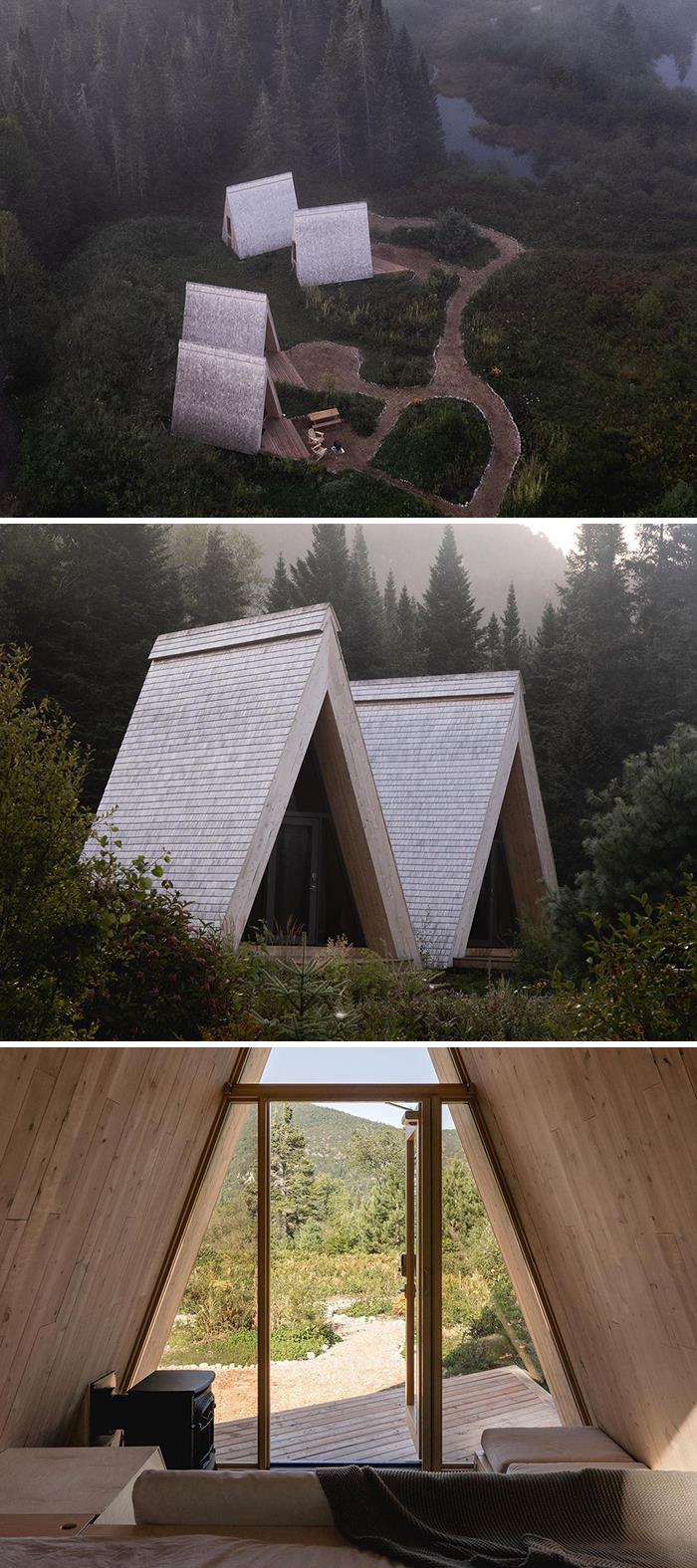
Project: Farouche Tremblant
Architecture: Atelier L'Abri
Photographer: Raphaël Thibodeau
Location: Lac-Supérieur, Quebec, Canada.
“Set against Mont-Tremblant National Park, and nestled within the Devil’s River valley, the Farouche agrotourism site offers a singular and unique concept for the Laurentians region of Quebec. Making the most of the natural and untamed qualities of the territory of almost one hundred acres, the project combines a #Nordic #farm, a café-bar, four-season micro-refuges, and an outdoor basecamp. On the north side of Chemin du Lac-Supérieur, a #barn serves as the headquarters for the farm activities. The route that leads to the small organic vegetable farm goes through the tunnel greenhouses, flower fields, and fallow land. The hiking trails begin behind the agricultural building and allow visitors of the Farouche site to explore the mountains of the Devil’s valley”, say the architects.
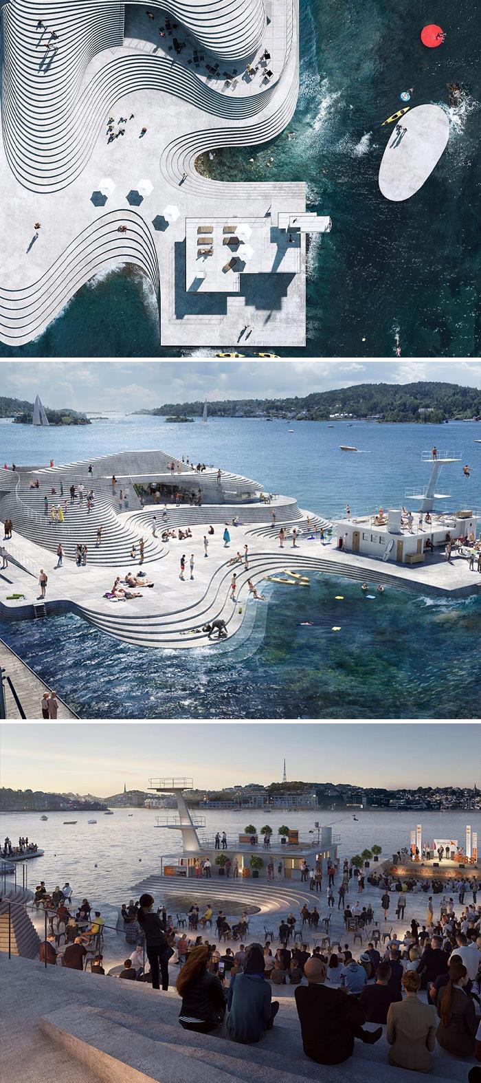
Project: Reconstruction of harbor bath Knubben
Architecture: Snøhetta
Visualization: Aesthetica Studio
Location: Arendal, Norway.
“Originally designed by architect Ketil Ugland, the facility was used by Arendal Swimming Club for diving competitions, swimming training and other aquatic activities. In 1947, the harbor bath closed its doors before being taken back into use during the 1960s, this time as a jazz club. With its slender and clean lines, Knubben was a small yet elegant example of the modernist spirit. After substantial decay however, the diving platform was demolished by the Norwegian Armed Forces in the 1980s. In 2018, Snøhetta was commissioned to revitalize the facility with a feasibility study. The new Knubben is a man-made structure with architecture that draws inspiration from the shapes we find in the islets and skerries along the Norwegian coast. It will resemble a block of stone shaped during the Last Glacial Period, characterized by abraded shapes where soft concave and convex walls form cavities in the landscape. To represent the terrain as accurately as possible, the construction will consist of horizontal layers following the contour lines of a map” say the architects.
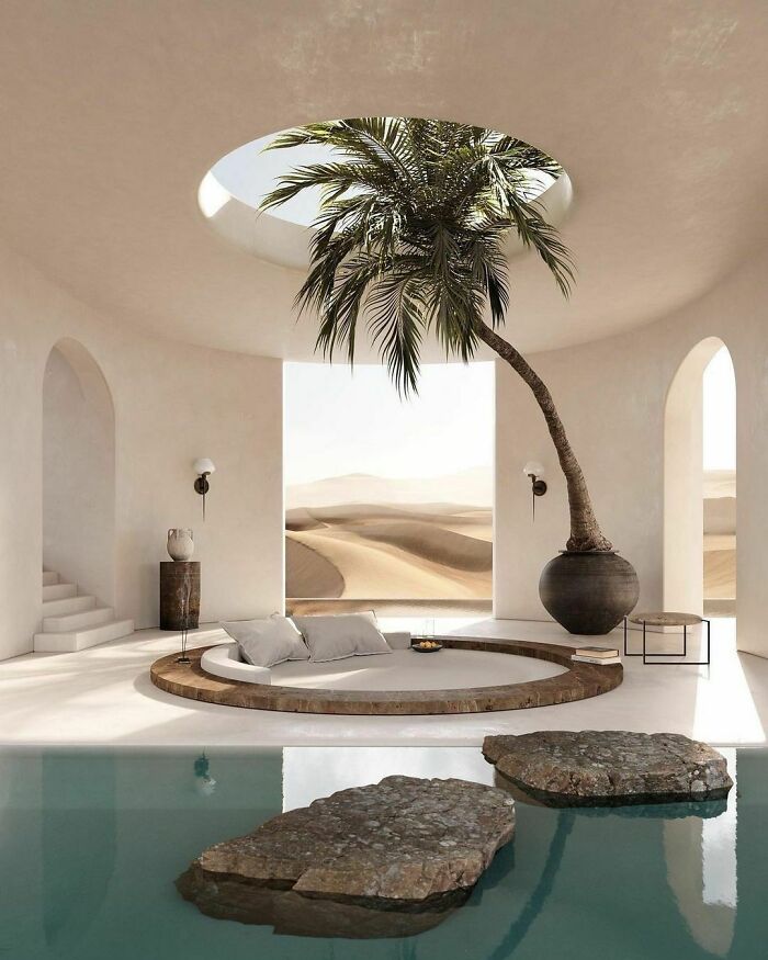
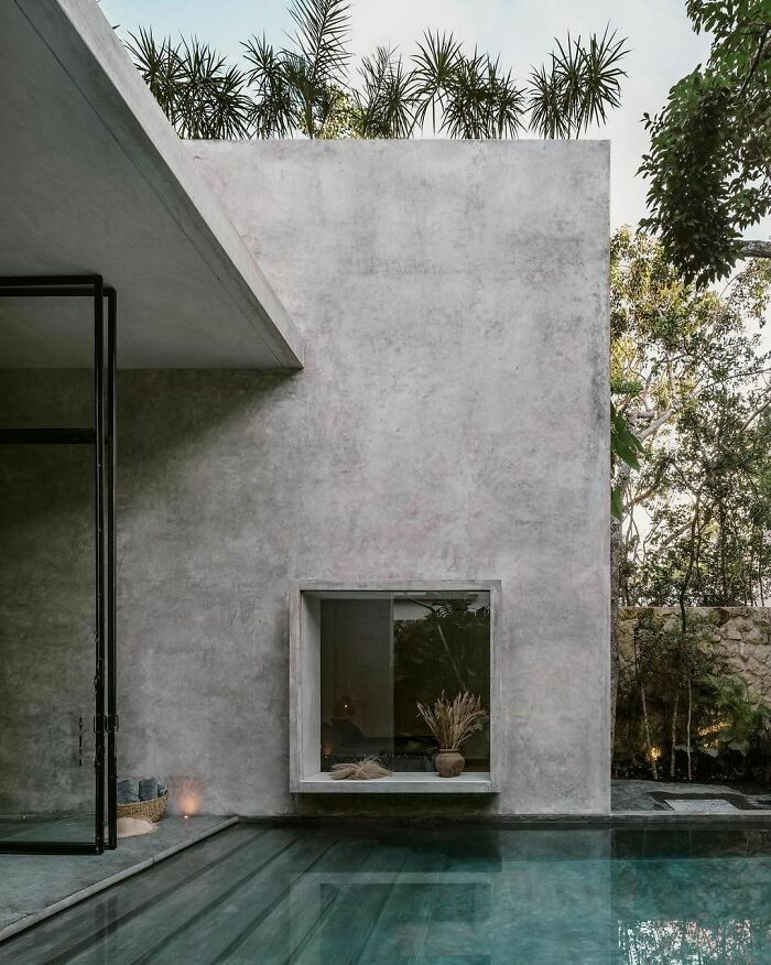
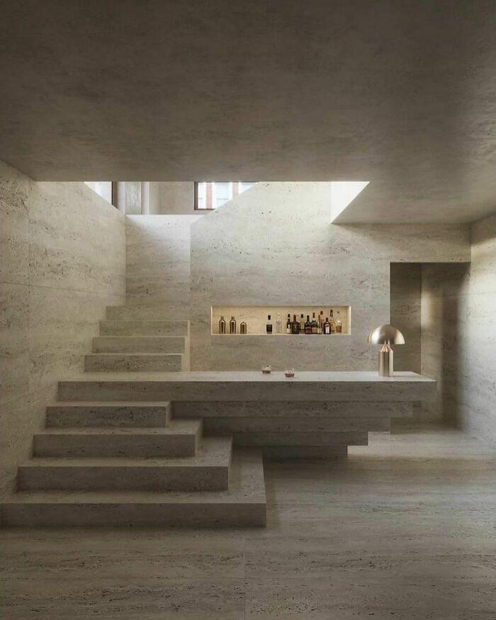
This texture on the walls went really well with the project’s context. The rounded contemplation space, right below the skylight and right aside the pool makes this space so peaceful!
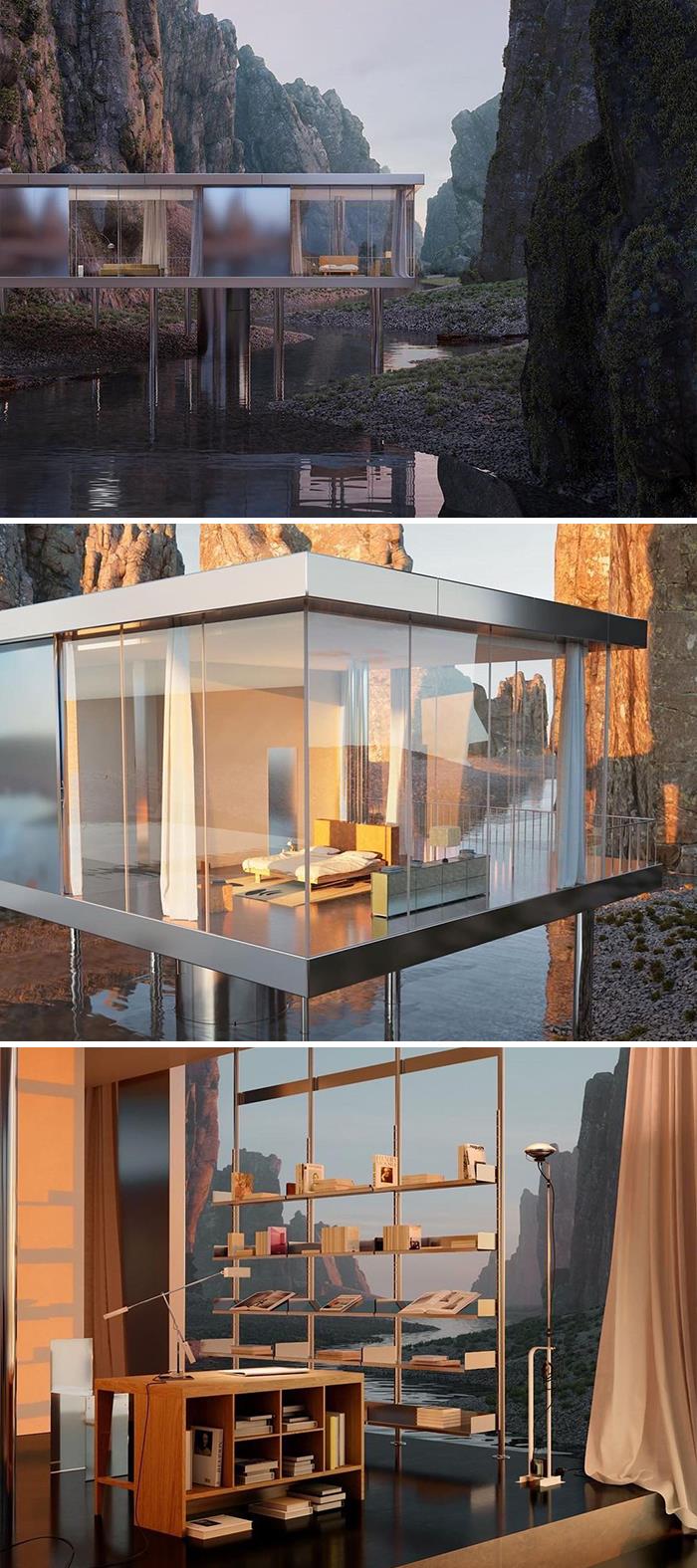
Project: Iceland House
Design & visualization: evoquelab in collaboration with Charlotte Taylor
Location: Iceland
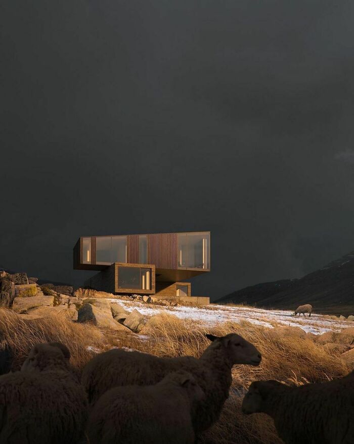
The glass windows allow the home owners to have a 360° view of the landscape. And what is interesting about this project is the contrast between the mountains and the house’s metal cladding, one which changes colors according to the sunlight. That makes the house look completely inserted and connected to its surroundings.
Books age very quickly if they are in direct sunlight at any time of day—or all day!
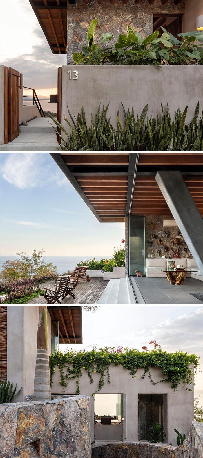
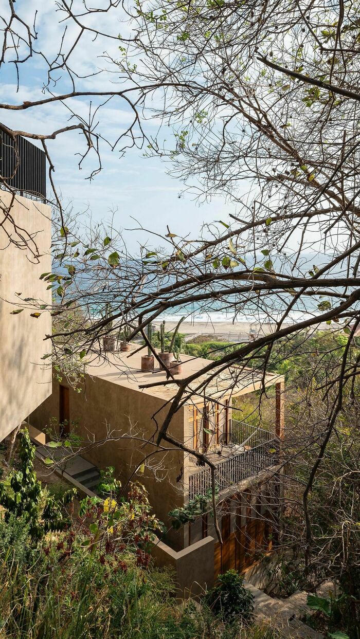
Mishel House is located in Mexico, in Zihuatanejo on a hill more than one hundred meters above sea level, so it has very privileged views of the Pacific Ocean.
“The house has three levels that are staggered, adapting to the topography of the land. Therefore we created some volumetry that generated movement and play on the facades integrating very naturally into its natural context. The house is accessed through the intermediate level where the living areas are located, the user can descend to the ground floor where the bedrooms are or go upstairs to the studio”, tell the architects.
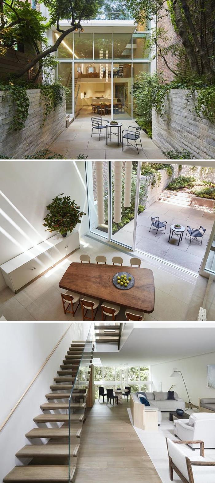
Designed by SKOLNICK Architecture + Design, Vertical Loft is located in the heart of the Greenwich Village historic district in New York City. With interior design by STUDIO VOLPE and photography by Thomas Loof, this project called for the complete renovation of a five-story, 1830’s townhouse.
“To extend the experience out to the garden and up to the sky, a dramatic four-story wall of glass envelops the back of the house, joining the interior to nature through views out to the rear garden and the existing mature plantings that were protected throughout construction. By carving out the earth at the garden level of the home, we created a seamless connection to the rear terrace. On the roof, we created a new penthouse space that similarly connects to a terrace garden”, tell the architects.
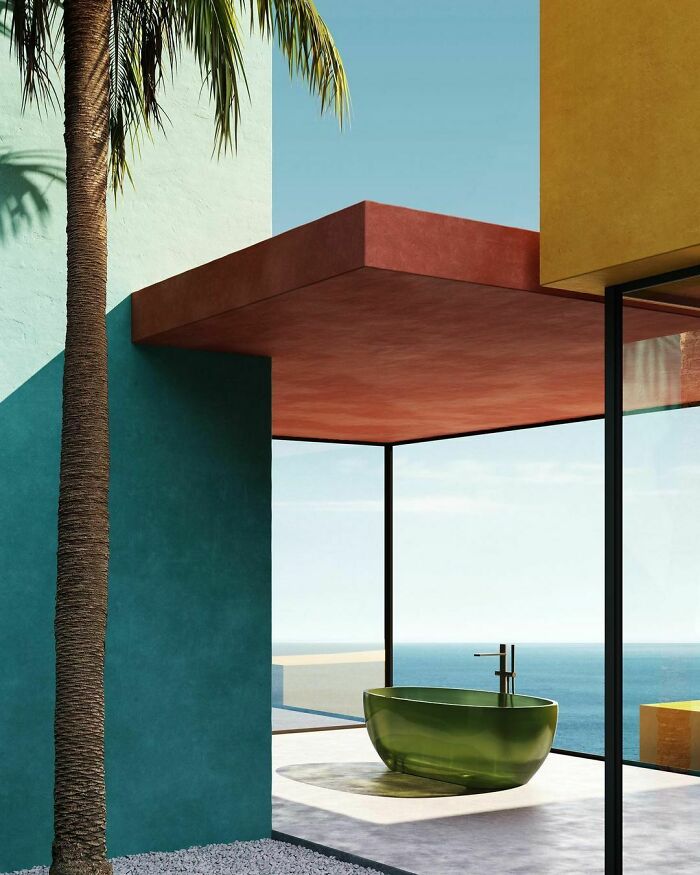
Plans, lines and colors define this contemporary nest around antoniolupi reflex bathtub in oleo cristalmood, a cocoon of light and well-being where the body is free to float in space and connect to the infinite.
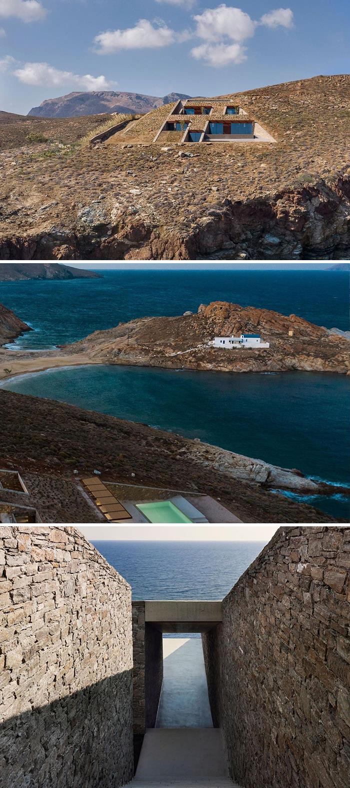
Poetically designed by Mold Architects, nCAVED House is located in Serifos Island, Greece, and brilliantly photographed by Yiorgis Yerolymbos and
Panagiotis Voumvakis.
In-caved areas are ‘negative’ spaces. They result from severing and removing part of the rock. This rough feeling of a natural cavity was what we aimed to recreate with our choice of materials and color palette. Stone, exposed concrete, wood and metal are used with precision to create coarse inner shells”, tells the architect Iliana Kerestetzi
Project: Residential Building in Uperaustria
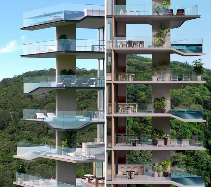
“With our latest residental building we propose new ways of living that react to changed values of conscious lifestyles. The different apartment sizing is going from 60m² up to 120m² for the penthouses. Each flat comes with a huge terrasse and a real planting area in every floor, the penthouses are directly connected to a roof garden. The building forces the idea to give people a real alternative solution to single housing, which is one of the biggest problems in terms of land resources” says the architect Peter Wimmesberger.
Lovely design and visualization by Jo-Anie Charland.
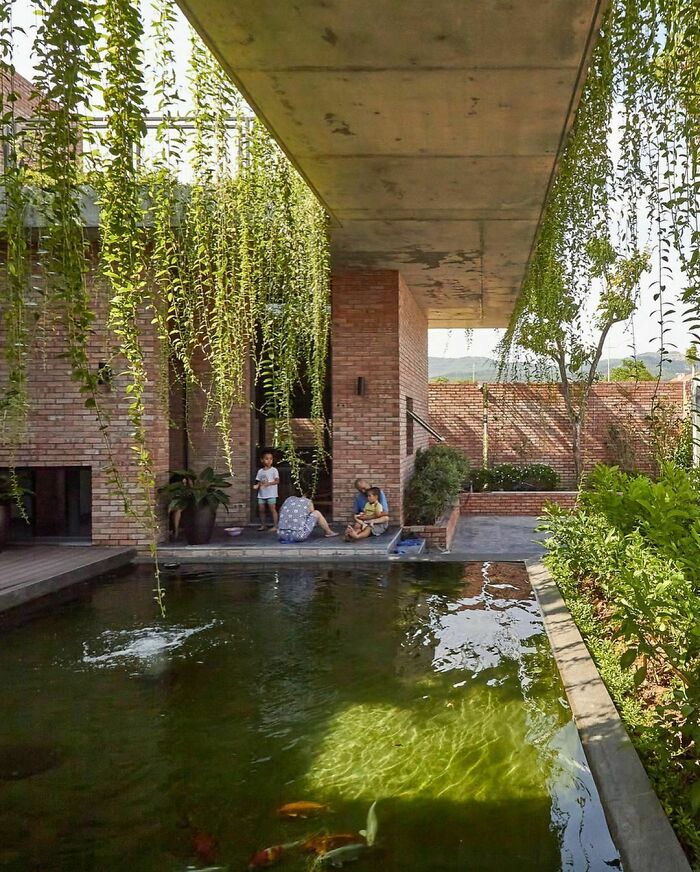
Designed by the studio HGAA and photographed by Duc Nguyen, Greenery Curtain House is located in Mao Khe, a growing area of urban and economic construction of Quang Ninh province, Vietnam.
“The house has a main floor and a small space above for reading and worship. From outside to inside, through the red brick wall is a layer of green trees covering the house. There are many layers of vegetation such as shade trees, shrubs, and creepers that hang down from the roof, forming a cover, preventing dust and urban noise. The main spaces are arranged around an inner courtyard in the middle of the house, creating a peaceful, quiet radial space, separate from the outside city”, tells the architects.
I love houses that have plants hanging down. It's like the plants are part of the house.
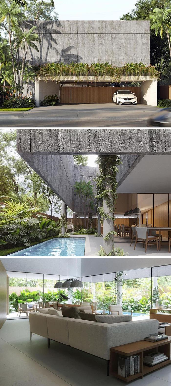
Designed by Laurent Troost Architectures and Gabriela Belfort and visualized by Studio F Visual, Casa Sombra is located in Manaus.
“Casa da Sombra is a house using a double concrete wall to protect from the sun while allowing for tropical plants and trees to grow in the shaded cuts and voids of the concrete block”, tell the architects.
Yoga House is designed and visualized by Obriy.
“The interior of the yoga house is very simple and minimalistic, so it’s very easy to mediate when there is nothing to distort and minds just float through the clean lines of the space. We believe that there is always something more behind visual simplicity. Big windows with incredible views allow visitors to feel themselves as an organic whole with nature regardless of activities”, tell the architects.
Mague House, designed by Mauricio Ceballos X Architects Mauricio Ceballos Pressler, is located Malinalco, Mexico, and photographed by Diego Padilla Magallanes.
“Starting from the pre-Hispanic cultural context, and the predominant connection with nature, the concept is based on the Mesoamerican worldview, where trees have a ritual meaning. The roots symbolize the connection with the underworld, the trunks the earthly human life and the cups the connection with the Gods. To emphasize this idea, the project is divided into three levels: the first one, a mirror base that gives continuity to the natural terrain and the roots of the trees, and allows the main volume of the house to give the sensation of floating; then, the living space, all on the same level where everyday life occurs; finally, the natural outer cover formed by the foliage of the trees”, tell the architects.
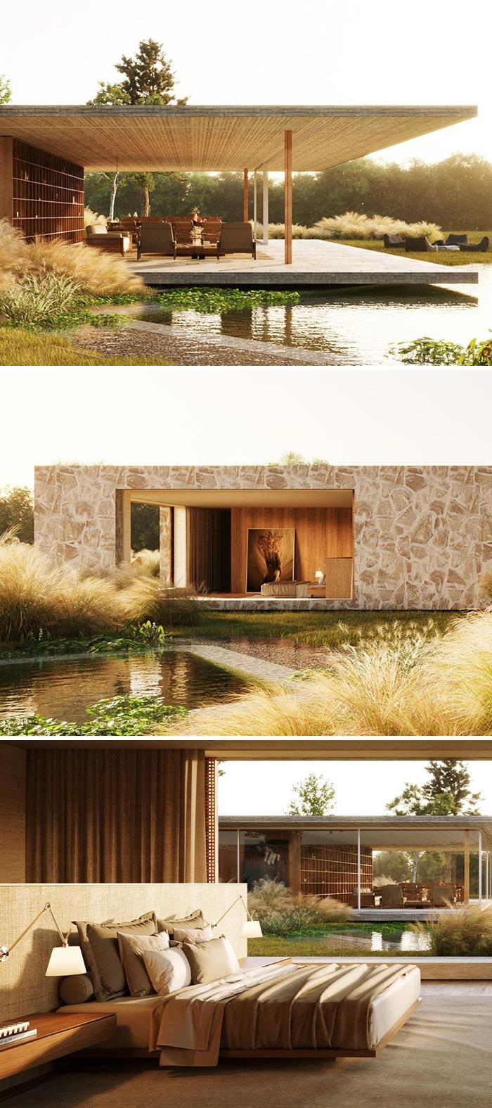
The one-story house called our attention to due its elegance and minimalistic selection of materials: #stone, concrete and wood. The project was designed to be integrated to the lake. You can even see the reflection of the terrace on the water, making it look like it’s floating.
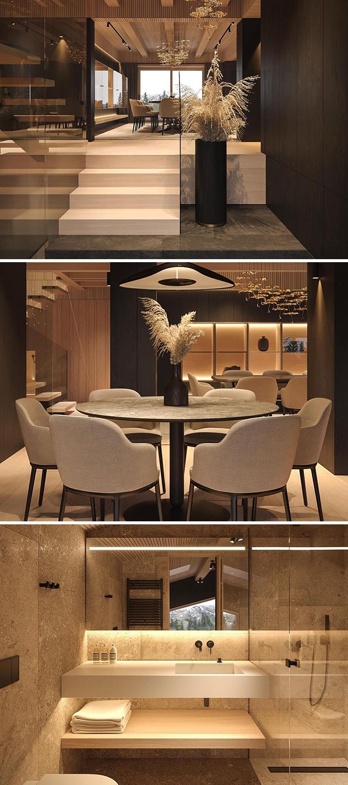
Inspired by the materials, colors and elements of the Alps nature, we have combined the traditional techniques, used in the construction of alpine houses for many centuries, with the new technologies. This allowed to create a traditional, but at the same time modern, unique and timeless style. Warm colors, elegant wooden surfaces, natural materials and expressive interior elements - all to create an atmosphere of comfort and relax after a long exciting day in #nature”, say the architects.
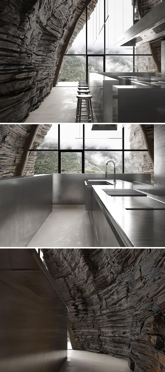
Project: Concept CP1R
Design: IGOR_SIROTOV_ARCHITECTS
Renders: IGOR_SIROTOV_ARCHITECTS
A restaurant inside a cave, that must have stunning views! The contrast between a natural element like the rock, and a mirrored surface like the stainless steel, creates an unique and intriguing atmosphere!
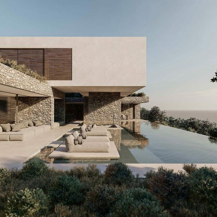
This residence is located in Kommeno bay, Corfu Island, in Greece.
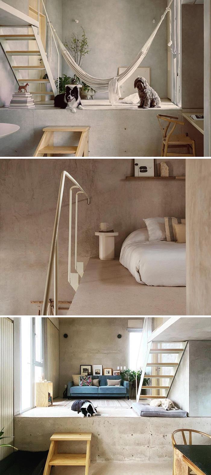
Project: Edifício Donceles 8
Architecture: KILTRO POLARIS + W E W I + Juan Carral Photographers: César Béjar & fabian martinez
Location: Mexico
This project is an ode to essentialism!
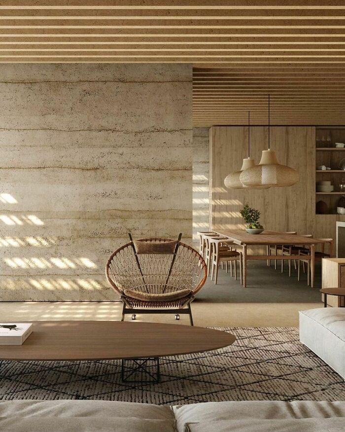
The rawness of the materials, the minimal furniture composition… simplicity as it’s finest!
Hacienda Sac Chic is located Acanceh, Mexico, and photographed by Marcelo Troché
“The proposal is synthesized in a geometrically simple volume in contraposition to the “organic and eclectic” architecture characteristic of the end of the nineteenth century that distinguishes the old house of the Henequen hacienda, where the guest house is located. The spatial typology of a typical “main house” of a Yucatan hacienda is recreated”, tell the architects.
Stunning composition of textures gives this project a very raw and welcoming feeling
I know I'll sound old, but where would you put your clothes? It's not a home
Designed by studio akamá, Casa Bonet is located in Port Andratx, Mallorca, Spain, and visualized by BergaGonzález.
“Casa Bonet displays a warm and welcoming atmosphere. The concept of the house is not only to use sustainable materials but also to reduce its ecological footprint as far as possible”, tell the architects.
Man-shaped, inspired by nature. This is Blue Heaven Empreendimentos new development, The Infinitá Treehouse, designed by the renowned French Brazilian architectural firm, TRIPTYQUE ARCHITECTURE.
The building is located in the southern coast of Brazil, in Itajaí beach.
3D animation: Improov l Diogo Poffo-Desenho sonhos
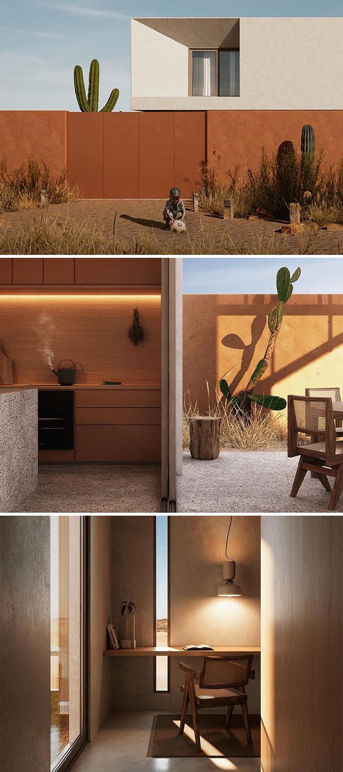
Project: Casa Niamey
Architecture: Arquitectos
Visualization: SILUETA
Location: Niger
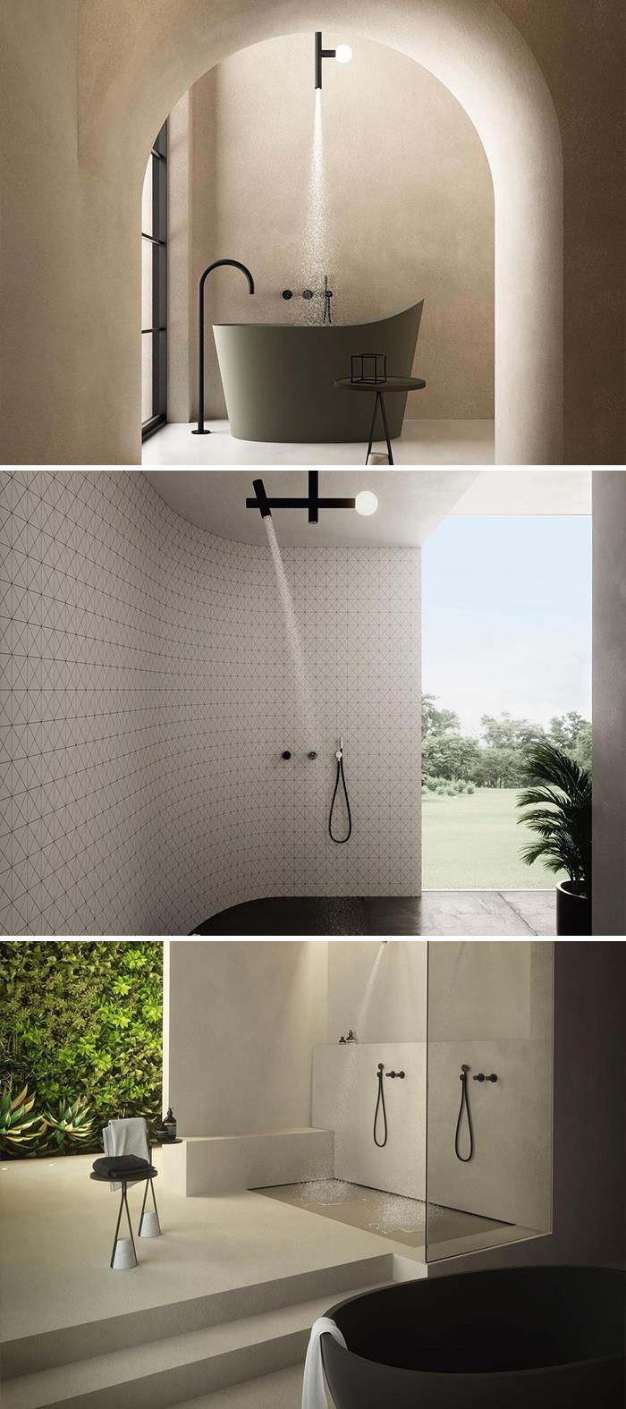
Within this finca in Ibiza, a quiet and charming retreat to enjoy the peaceful island life, this wellness oasis provides a contemporary feel whilst retaining the rusticity of the building. The interplay between its Ibicencan aesthetic and some refined pieces like the Borghi washbasin with the tub in Mostato, the Tramato carpet with the Tralerighe wallpaper, the Apollo showerheads, creates an harmonious eclectic environment that maximize the interactions between light and space, textures and colors, function and flows.
Never understood the two wash basin thing, let's go wash our hands at the same time...
House is a conceptual project to be located in the Swiss Alps
“Until a single house is built, there is a lot of dialogue and communication between the architect and the client. During this project, there were countless precious stories filled with respect for each other, so all the processes and results remained happy memories. This is why the name of this project is ‘Precious talk’”, tell the architects.
“The tranquility, charm and rich vegetation of Antônio Parreiras St naturally led us to design solutions that would subtly insert the building into the terrain. Using textures of natural elements such as stone and wood in its materiality was an important pillar of this integration”
Love this house. All the plants are great. I don't think I would ever leave.
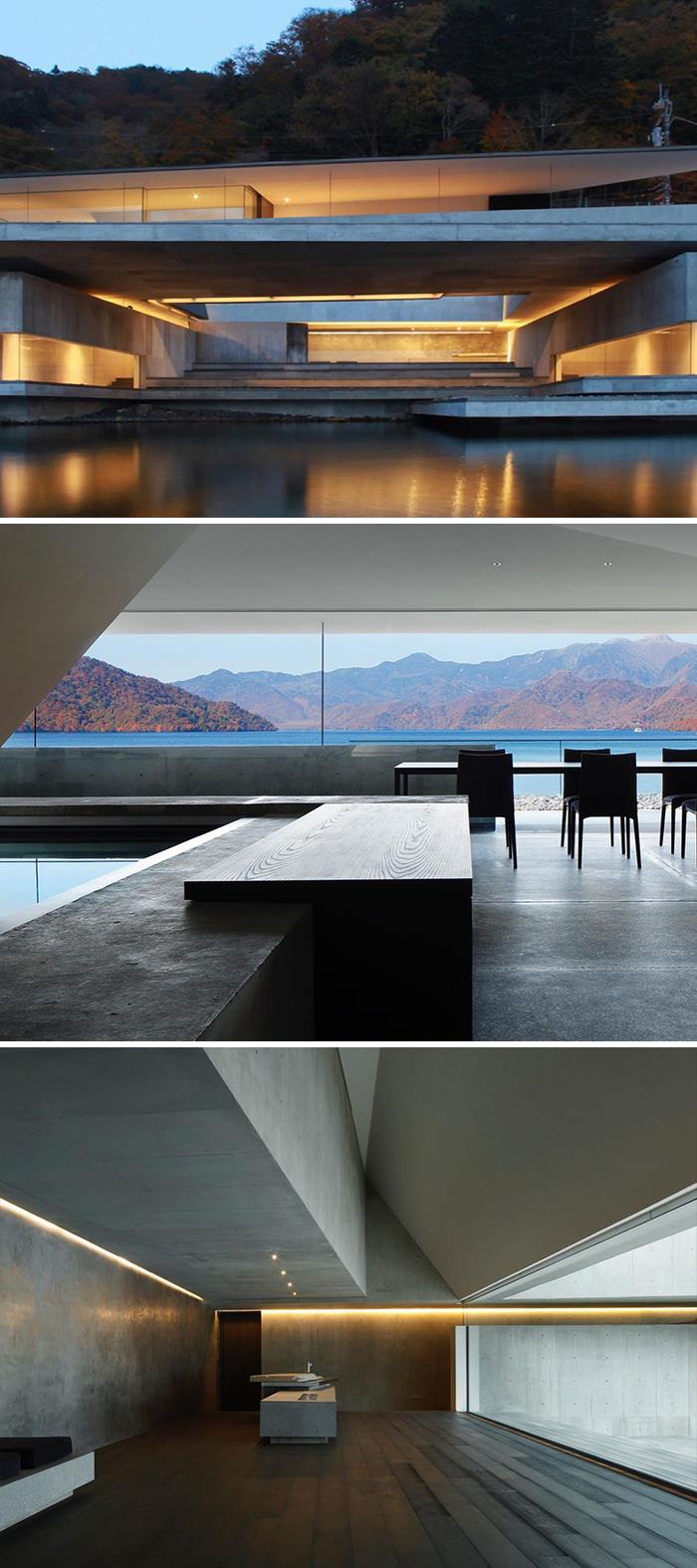
Designed by Nikken Sekkei, On the Water House is located in Japan and photographed by Gankosha, Harunori Noda and Nacasa & Partners.
“Situated alongside a lake, this guesthouse was designed as a continuous spiral space flowing from the approach to the bedrooms. Each step taken deeper inside the building reveals a changing lakefront view. The various lakeside environments, including the sound of ripples, light reflecting from the water surface, the humidity and thermal radiation, are also carried on into the spiral, but in a non-uniform distribution due to changes in physical distance from the water surface”, tell the architects.
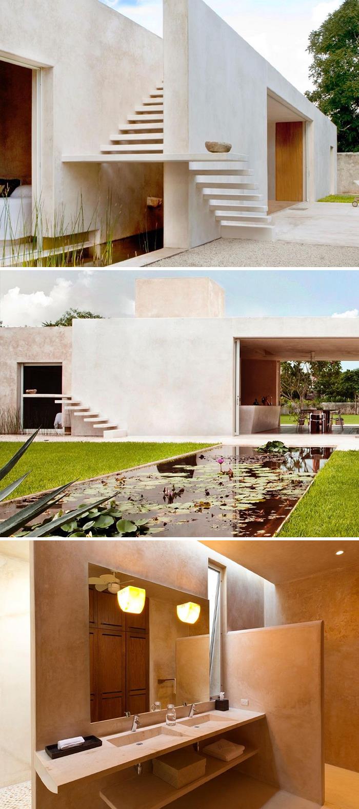
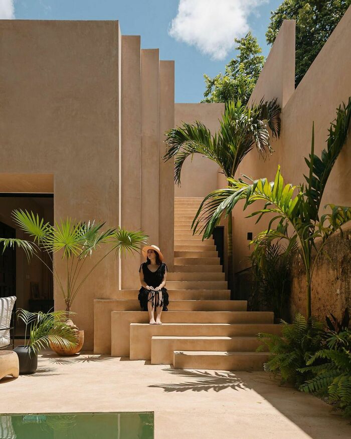
“Casa Houlpoch is an old Yucatecan house from the end of the last century that gets its name from a snake from the region that regularly ‘visited’ the property's ruins. In the central courtyard, a chukum pool surrounds the stone vestiges of an old colonial structure where a large poplar tree generates a spectacular play of light and shadow with its frond, creating the perfect atmosphere to host an outdoor kitchen. The volumetry of the back of the property reads as a totally disruptive design with respect to the historical part of the residence where the steps to the second level (where two rooms and a terrace are located) serve as a visual axis and as an element. sculptural, becoming the hallmark of its architecture for its dynamism. The ‘winding’ with which the stairs of Houlpoch House begin takes as its inspiration the millenary staircase of the ancient temple of Kukulkán (Feathered Serpent and god in Mayan mythology) in Chichén Itzá”, say the architects.
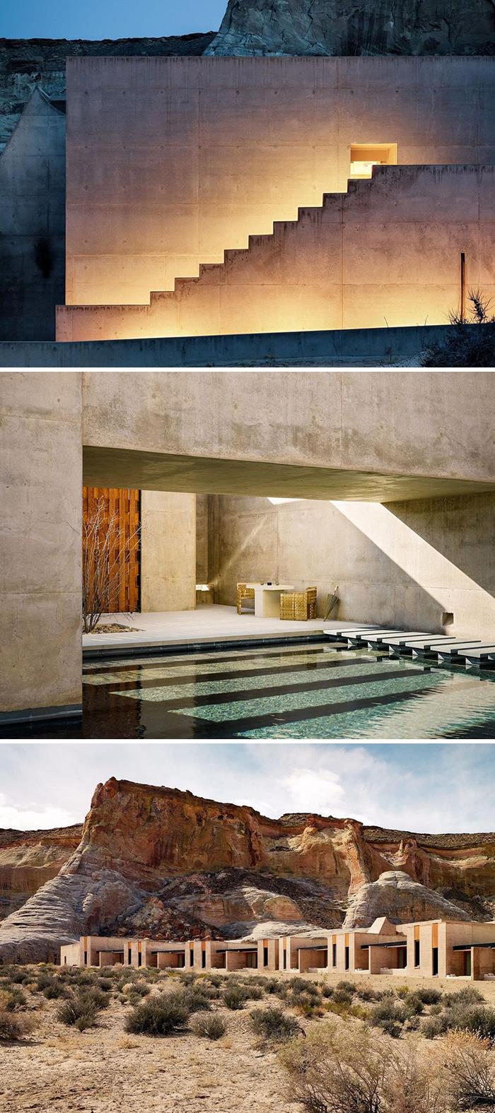
Photographed by Joe Fletcher Photography, Amangiri Resort is a an Adrian Zecha-inspired design in collaboration with architects Rick Joy, Marwan Al-Sayed and Wendell Burnette.
Located in Utah, USA, the aim of the designers was to build something that was a contemporary interpretation of native Indian architecture. “Not perfectly adapted, but hopefully generating a sense and spirit of it”, tells Zecha. “Also, that it would respect the natural environment. This was the most important aspect of the whole development.”
“The house features a restrained vocabulary of rift sawn oak, mill finished steel, galvanized metal panels, and concrete—that alternates in orientation and pattern. Taken together, these materials create an environment rich in texture and animated by sun and shade over the course of a day”, tell the architects.
Location: Kona, Hawaii
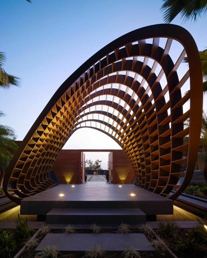
Located in Kona, Hawaii, harmony with nature is at the heart of this residence. To help maintain the environmental sensitivity of the house, rainwater is collected and diverted to three drywells while roof-mounted photovoltaic panels offset energy usage. Likewise, the material palette was carefully considered with reclaimed teak utilized for the exterior siding while porcelain tile - a naturally sustainable and hygienic material - was used extensively throughout the property. The brand’s new initiative “Ceramics of Italy for Sustainability” tells the story behind Italian tile’s eco-forward production practices and products, emphasizing the four natural elements that compose these Italian ceramics: earth, water, fire, and air.
A project developed with particular attention to the main focus of the Fuorisalone "Forms of Living": a reflection through design on living spaces and on the concept of well-being, in light of the delicate historical moment we are experiencing.
The new collection of Apollo shower heads, designed by Brian Sironi, combines two primordial elements like water and light through the purity of its shapes to offer a real bath of light in the name of a multisensory well-being experience.
I am always amazed by the not practical side of these houses, architects never clean anything in their lives? or they hate housekeeper?
“The interior develops an organic minimalism working through bright and pure spaces with the intention of generating calm and giving the ability to perceive the city from the windows and to be connected from home. The main patio is a tribute to the architecture of the neighborhood and its historical evolution to modernity through catenary arches honoring the universal legacy of Gaudí, these start with a stereotomic structure to transform into a light and tectonic form. The project is located in an area dedicated to the young life of the city, creating new ways of living for new generations” tells Hernández.
“The building itself is an urban crossing with a permeable configuration. It has several accesses and is surrounded by native vegetation. This building is designed so that the daily life of the city coexists with the activities of the hotel and its users. It has been conceived as an epicentre, a centre of diverse cultural events that seek to promote local creative industries through art, gastronomic events, fairs, concerts, theatre, nightlife and various types of recreation. The life of the hotel and the city are to be mixed and to complement each other”, tell the architects.
Location: #Vienna, #Austria
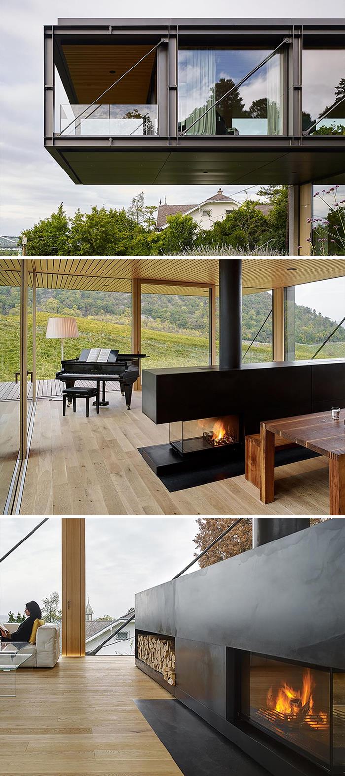
“In a contrast to the transparent steel and glass façade of the structure, the interior is completely clad in oak like a wooden box. Despite the all-around glazing, this creates a warm atmosphere and a feeling of security without disturbing the direct connection to the surrounding nature. The result is a modern, cubic building with high architectural standards that takes advantage of the difficult slope. Self-confident, with clear, almost strict lines, the house stages itself and the surrounding landscape” say the architects.
Framed by nature, MC House's project is an ode to minimalism. The architects José Basiches and Ronaldo Shinohara audaciously proposed to coat the 1,800 sqm house in only one finishing: white concrete. The result is a poetic contrast between architecture and the native vegetation that is perfectly integrated to the landscape design proposed by Hanazaki. Another highlight in the project is the elegant lighting design, which makes the house work as a lamp during nights, promoting a refugee in the city to the family who lives there.
Casa Montanha is located in Nova Lima, Minas Gerais, Brazil. The house is a perfect example of a respectful integration between nature and architecture.
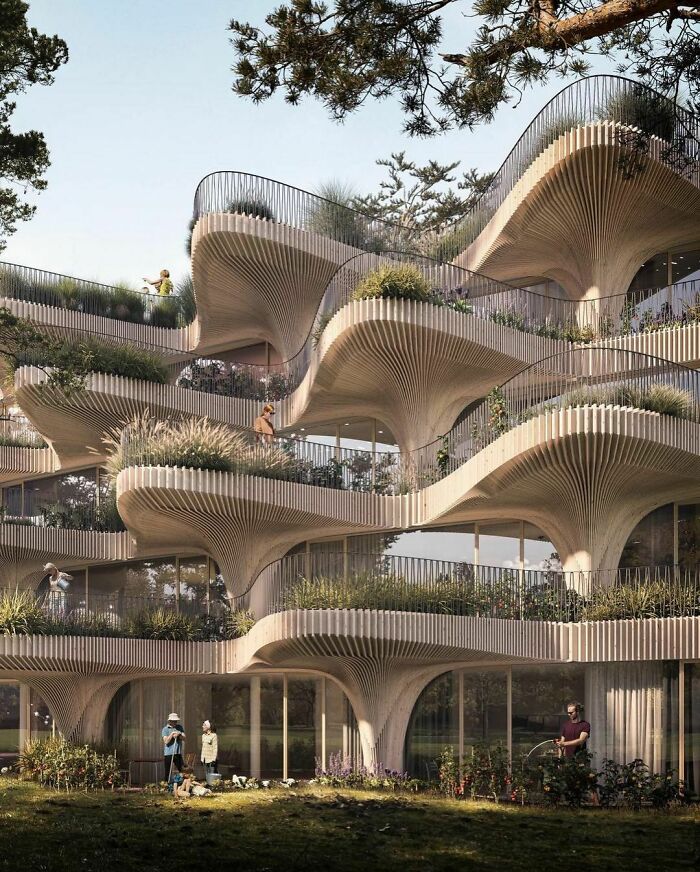
This is such an interesting composition of volumes! The vegetation also adds a special sensation around the house.
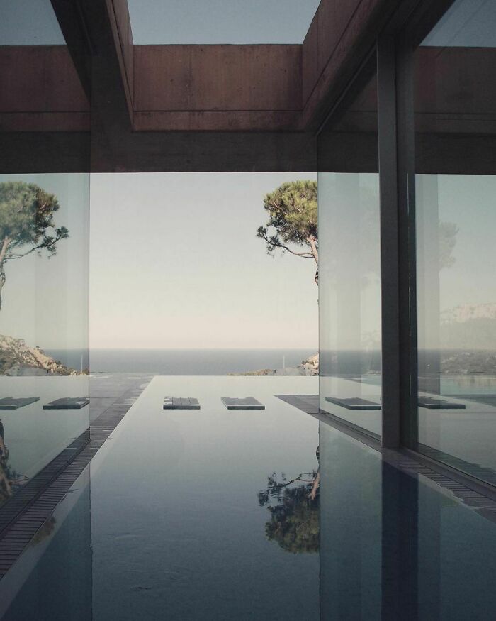
Designed by Dara Huang & Roberto Manzetti, Villa Mosca Bianca is located at Lago Maggiore, Italy. "The context of the actual site dictated the shape of the house. We wanted each bedroom experience to have a various environment in landscape by inserting fingers into each region. From the thick forest of pine to the water edge of the lake" tell the architects. To frame this fantastic view of the lake, they specified products, such as the Insulated Sliding Doors of two different collections, Sky-Frame Arc and Sky-Frame Classic.
Casa Wabi is located in Puerto Escondido, Oaxaca.
“The original house, ground floor and basement, had a facade facing the sea, formed by a perimeter wall construction, with many small windows and a very fragmented distribution. They said ‘We want to look at the sea! The best of this house is the view, but when we are inside, we can hardly appreciate it. We also want big spaces; we do not need so many rooms’. From there, what started as a small project became a major intervention. The plan form of the house was already defined, because the maximum of allowed construction was built, so we decided to respect the perimeter in order to keep the original structure”, say the architects.
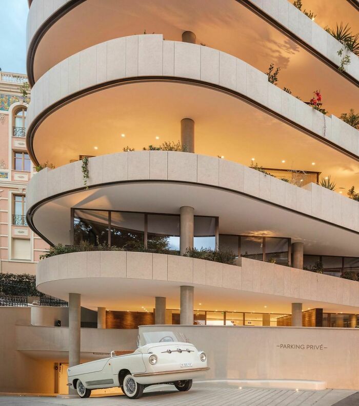
La Petite Afrique Building is located at the heart of Monte Carlo, Monaco. "To appreciate the view of the Casino gardens and, on the upper floors, of the Mediterranean Sea, was one of the most important guidelines for this project since its first conception. Each floor is entirely surrounded with balcony gardens, turning the outdoor view into an extension of the indoor area." say the architects.
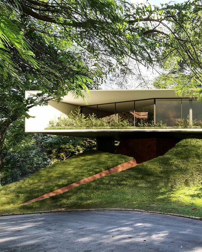
Loocation: Barueri, Brazil.
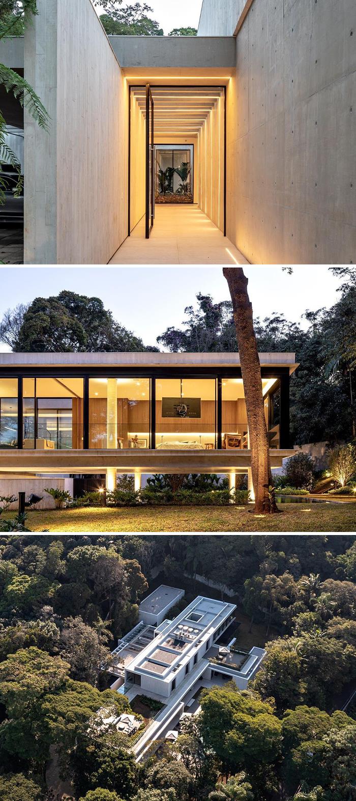
As you can see in the last picture, the architects proposed a very interesting geometry for the project’s implantation. Taking advantage of the site’s topography, the concrete box lands on the slopes, one which has a void for the house’s entrance.
Location: Mazunte, Mexico.
Location: Altea, Alicante, Spain
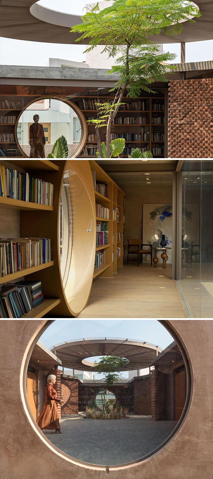
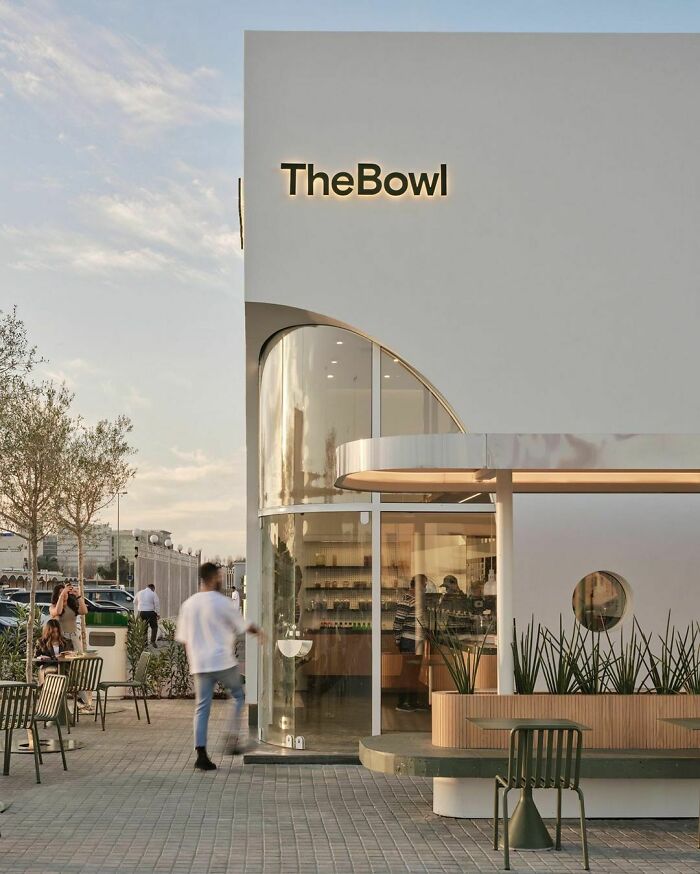
The minimalistic palette of colors and materials, composed of white, green and wood, gives the restaurant a look of freshness. Besides that, it also has a very welcoming atmosphere, that results from the combination of the curved glass entrance with the round windows, that follows the same aesthetic guideline.
“Casa Mate stands on land south of the city of Guadalajara, conceived as a country house in which geometry plays a key role in articulating the project through a corridor with a walled central garden that seeks to be a solid generator in each of the the interior spaces. The architectural floor plan and volumetry are adjusted to orthogonal lines, seeking at all times for the interior spaces to interact with the visual finishes generated by the project. In the front part of the house is the entrance terrace with kitchen and living room that connects with the entrance plate that, when opened, becomes a single space”
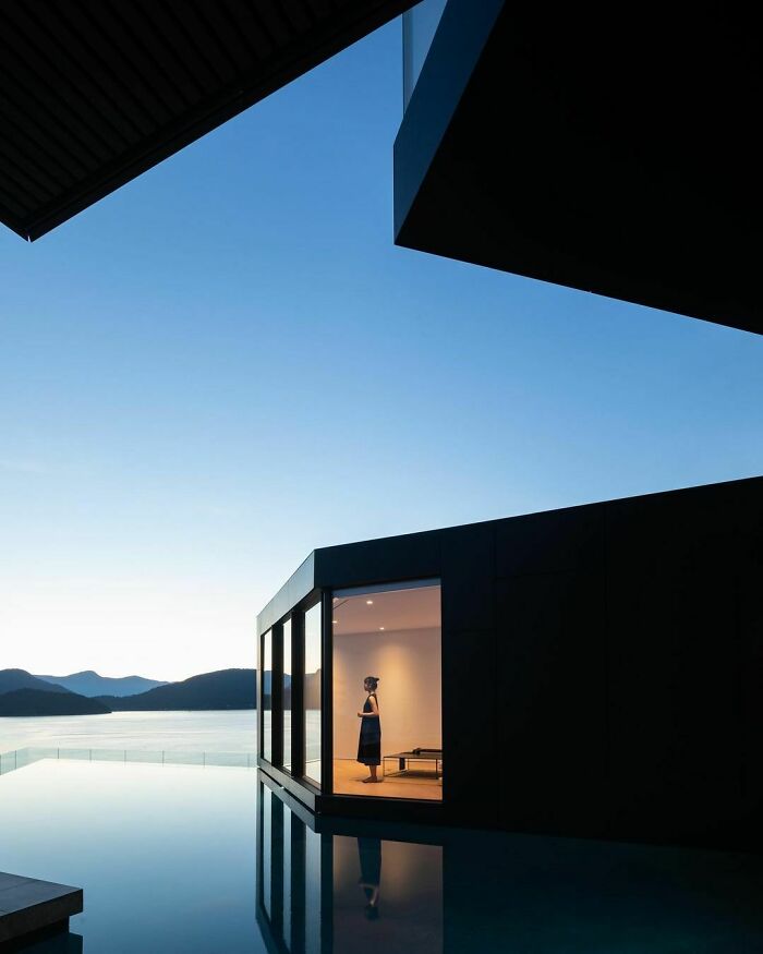
“The home accommodates diverse living arrangements while connecting to the site’s abundant natural character. It is an expression of the client’s desire to create a gathering place for current and future generations while still being able to accommodate a smaller family unit. The house takes its cues from distinct and divergent topographical features: views and light to the southwest and the extreme contours that drop to the Salish Sea to the west. The house pivots around these two axes resulting in a shifting spatial geometry at the intersection of the main and upper floors which appears as a void in the middle of the site”, say the architects.
I love multi-generational/communal living concepts. I wouldn't want to live with my parents, but especially in the US, residential architecture is so isolated and compartmentalized. I'm fascinated by explorations in privacy/community. I'd happily live connected to certain friends and found-family.
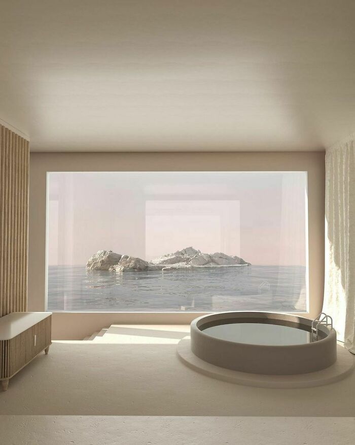
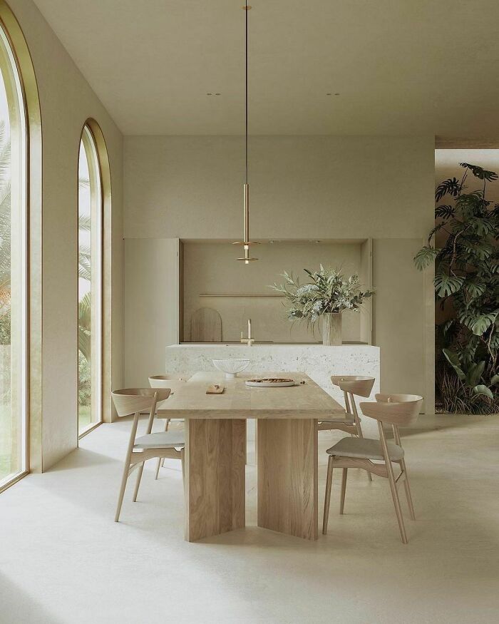
This project is pure elegance. The soft and light tones palette of materials, combined with its textures make it such a welcoming space!
Soft colours like these make me crave for a glass of champagne and some salmon <3
Location: Crete, Greece
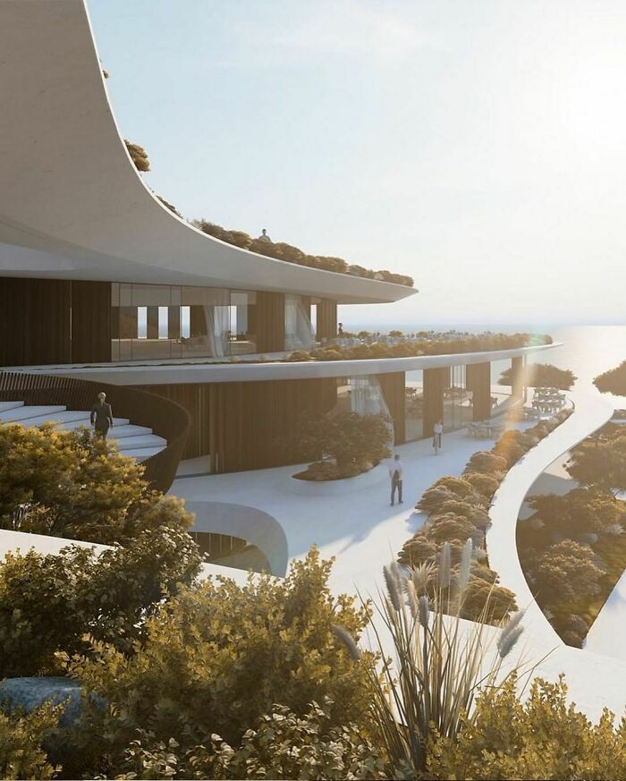
The curved lines of this project are stunning! The implantation follows the landscape natural form, creating incredible views to the ocean.
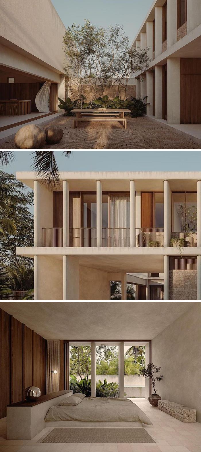
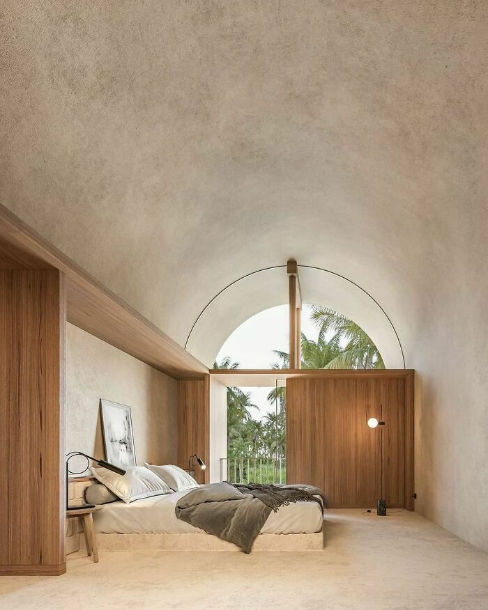
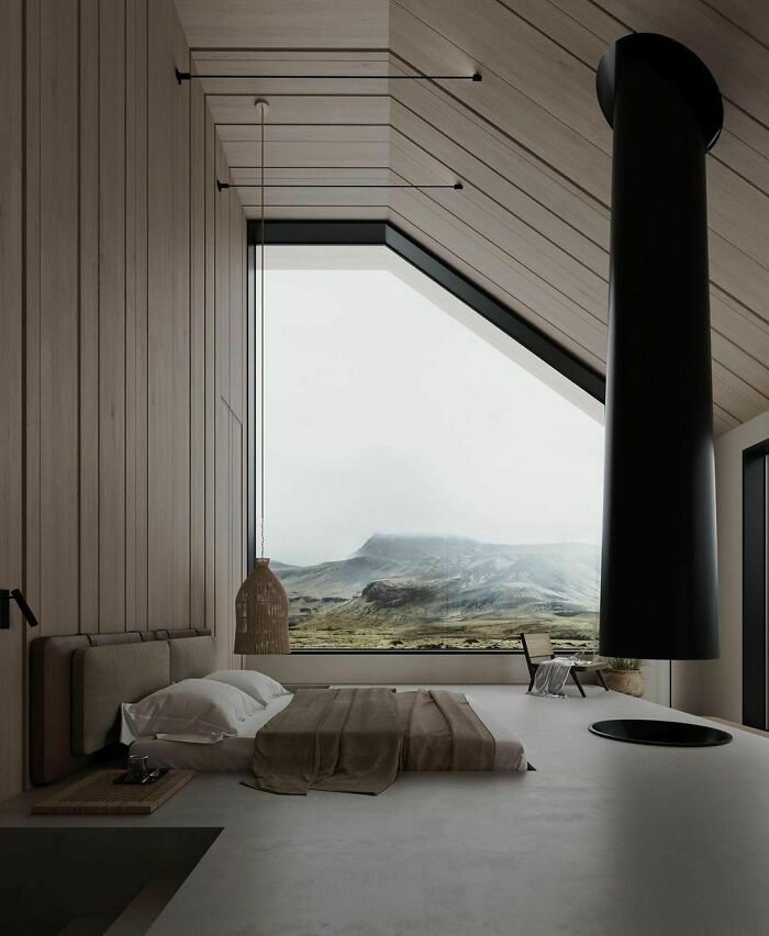
This bedroom follows a minimalist essence, combining only three main materials: wood, concrete and the black metal of the fireplace. The bed is built into the concrete floor, making it look very short and elegant.
“The bed is built into the concrete floor, making it look very short and elegant.” And very annoying to get up from.
Location: Varna, Bulgaria
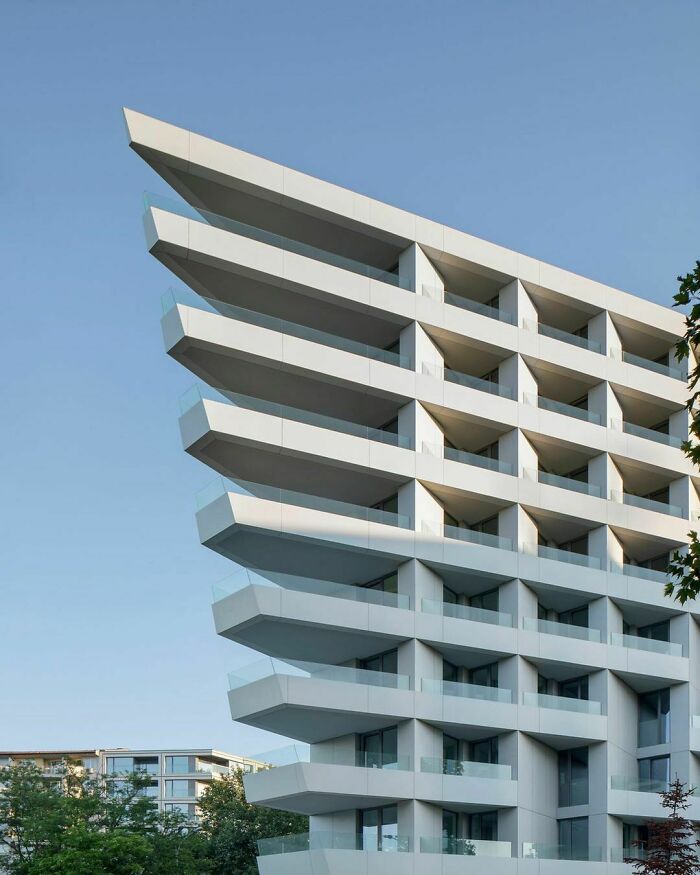
“Creating a design that fits into a restrictive triangle-shaped plot is the main challenge for the project. This is the datum for its shape in plan and its distinctive spatial-volume structure. Whiteness and horizontal distribution are typical for buildings, and the final result is a building that has a distinguishable silhouette and is open to various associations and interpretations.”
Location: Cancun, QuintanoRoo, Mexico
“Being very unconventional, the design does not seek to meet the standards of what a common domestic staircase looks like, it seeks something more, it seeks the personality of being a #sculpture without having to sacrifice functionality, since it is powerful enough to support glass railings or blacksmithing without violating their individuality”.
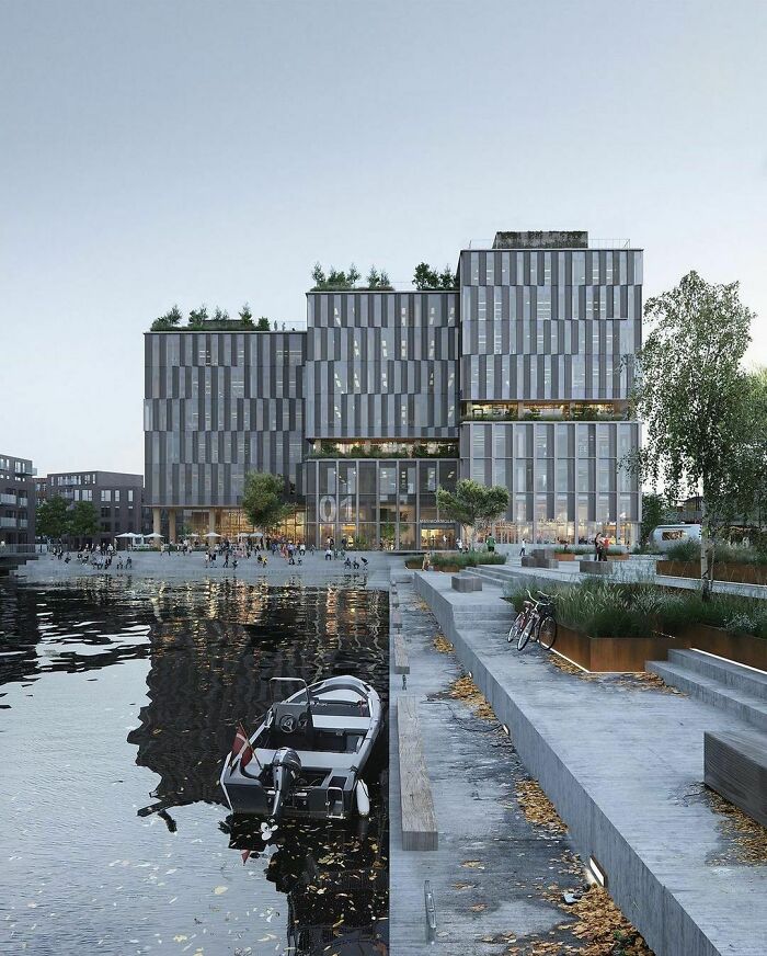
Location: Copenhagen, Denmark
Here is what the architects have to say about the design: “The landscape design at Marmormolen in Copenhagen revolves around a unified symbiosis of greenery on the rooftops, courtyards, inside and around the office building - which will become one of Denmark's largest timber constructions - to create a living and lush experience for employees, visitors and pedestrians. A great variety of local trees, bushes, perennials, grasses and edible herbs create a microclimate around the building that helps with the at times rough wind and traffic noise, resulting in an inviting green oasis for humans and local insects”.
91 pictures of the SAME design aesthetic, same "naturalistic" styles, same no colour colour scheme , same beds, round on the floor. It must be boring being so rich
Designed by 'tect who's stuck 'tween a rock and a hard place!
Load More Replies...I don't quite understand how you are "inspired by nature" to build a collection of post-apocalyptic concrete and glass boxes.
If you can afford the houses then you can afford to pay a window cleaner.
Load More Replies...91 pictures of the SAME design aesthetic, same "naturalistic" styles, same no colour colour scheme , same beds, round on the floor. It must be boring being so rich
Designed by 'tect who's stuck 'tween a rock and a hard place!
Load More Replies...I don't quite understand how you are "inspired by nature" to build a collection of post-apocalyptic concrete and glass boxes.
If you can afford the houses then you can afford to pay a window cleaner.
Load More Replies...
 Dark Mode

 No fees, cancel anytime


