Nowadays all our cameras will take good enough photos to post it at least on Facebook or Instagram. So obviously the gear is not crucial to produce an impressive photo. Many people rely on the post editing with various apps, software and plug-ins to enhance the photo. Yes, that is essential nowadays.
But – you can only enhance a photo which is well composed from the beginning. No Photoshop can turn a badly taken photo into a good one.
So what are the secrets to compose a photo? How can we train our eye to see the perfect point of view?
To give away the biggest secret at the beginning – there is not ONE rule. Because there is simply no rule at all! Every subject, every landscape, every situation demands for a different point of view and composition to bring out the best of the situation. So let’s start with some examples to see how we can master landscape situations.
During our photo tours we train our eyes constantly for the best composition, you are welcome to join us: www.phototourgroup.com
More info: phototourgroup.com
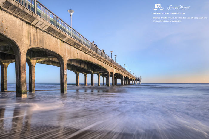
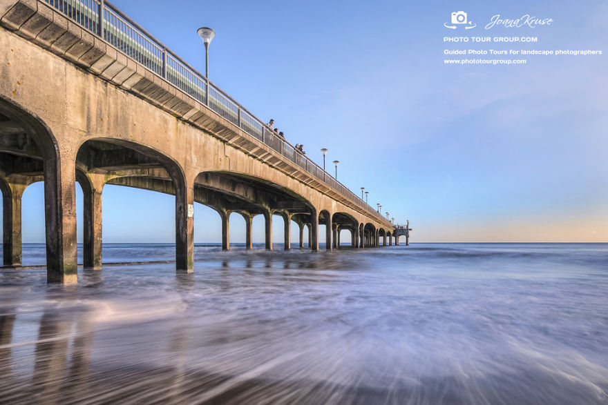
1. The Diagonal
Compose your image that “lines” and subjects start at one corner of the photo and will lead in a diagonal towards the middle. This will draw the attention of the viewer.
Photo copyright: Joana Kruse (www.joanaimages.com)
Image credits: www.phototourgroup.com
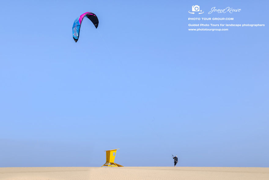
2. Negative Space
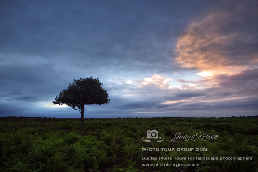
A typical amateur mistake is to think, that the main subject should fill out the whole picture to make it more impressive. Yes, sometimes this works. But a very strong effect is actually the negative space. Give some space around your subject and the attention of the viewer will be even greater, the emphasis on the subject even stronger.
Photo copyright: Joana Kruse (www.joanaimages.com)
Image credits: www.phototourgroup.com
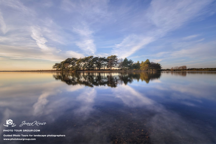
3. Symmetry
A lot of people in my photo group tell me, that they learned in photo courses, one should never place the subject in the middle.
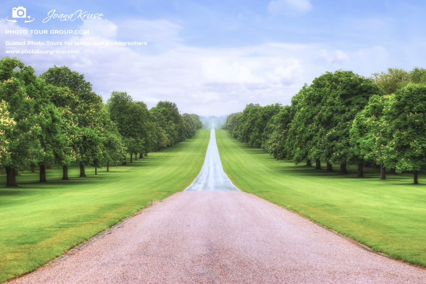
Well – this is not always right. Sometimes you can create a strong impact when you take your subject in the middle. For example if there is symmetry in your photo.
Photo copyright: Joana Kruse (www.joanaimages.com)
Image credits: www.phototourgroup.com
4. Panorama Shots With Foreground
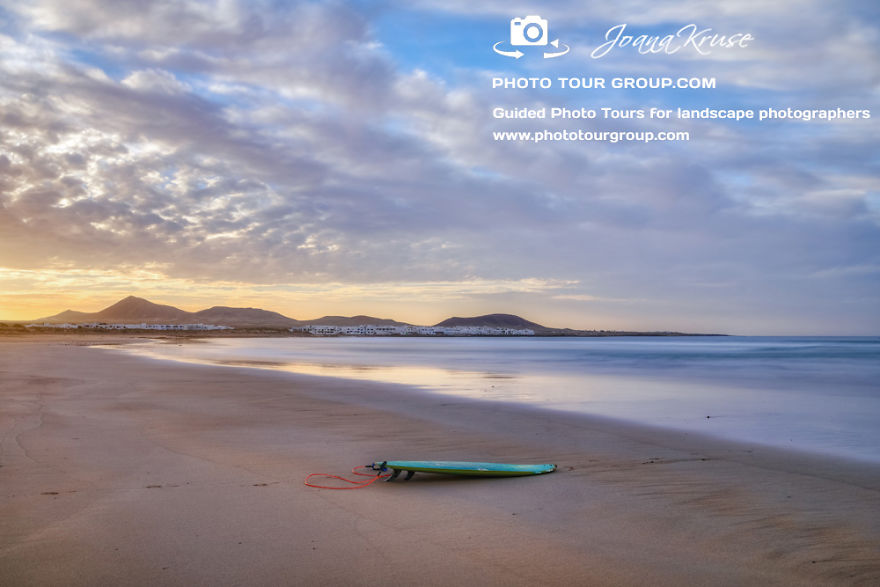
There is nothing more complicated than a good panorama shot if we do not want to crop it. We desperately need something in the foreground. But it should emphasis only the panorama and shouldn’t draw too much of attention to the viewer. Like this abandoned surf board, left on a beach during sunset. It tells a story that this is a surfing beach, the dimension tells us how wide and spacious the beach is, but still your eye is not too busy to be distracted from the lovely sky and the mountain range in the background.
Photo copyright: Joana Kruse (www.joanaimages.com)
Image credits: www.phototourgroup.com
5. 3D Effect
A photo is flat, but still we are able to produce a 3D effect by composing two subjects with different distances in the photo. A great 3D effect you get if you focus on the more distant subject. But of course that depends which story you want to tell with your photo. You may also focus on the closer subject and show the distant subject only blurred.
Photo copyright: Joana Kruse (www.joanaimages.com)
Image credits: www.phototourgroup.com
6. Left-Right-Ratio
Bigger, darker objects are appreciated as heavier than smaller and lighter objects. In our culture we read from left to right. We open a book on the right side, the closed and heavier side is on the left. That is why we also experience photos with heavier objects on the left side as pleasant to view. So if possible – compose your photo with heavier and bigger objects on the left.
Photo copyright: Joana Kruse (www.joanaimages.com)
Image credits: www.phototourgroup.com
7. Leading Lines
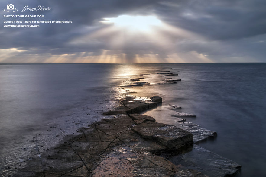
One of the strongest ways to compose a photo are the leading lines. Take steps, paths, roads, rocks, patterns in the ground or whatever you find to “lead” the eye of the viewer to the subject or to the horizon. The viewer will feel like being “sucked” into the photo
Photo copyright: Joana Kruse (www.joanaimages.com)
Image credits: www.phototourgroup.com
8. Leading With Light
You can create also a very simple leading of the eyes of the viewer by having darker colours at the bottom and lighter at the top. Darker colours are experienced as “heavier”, so the photo will be “grounded”. If there are darker colours at the top and lighter at the bottom – it feels wrong, as the “lighter” part can not “carry” the heavier, darker part.
Photo copyright: Joana Kruse (www.joanaimages.com)
Image credits: www.phototourgroup.com
472views
Share on Facebook
 Dark Mode

 No fees, cancel anytime






















4
0