Designer Challenges Himself To Create Logos With Hidden Meanings For A Year, And Result Is Amazing
Wordplay is a never-ending source of amusement for me, with funny puns, spoonerisms, and double entendres bringing a little extra color and life to the everyday language that we sometimes take for granted.
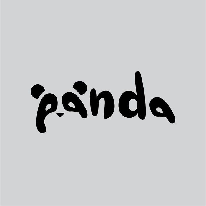
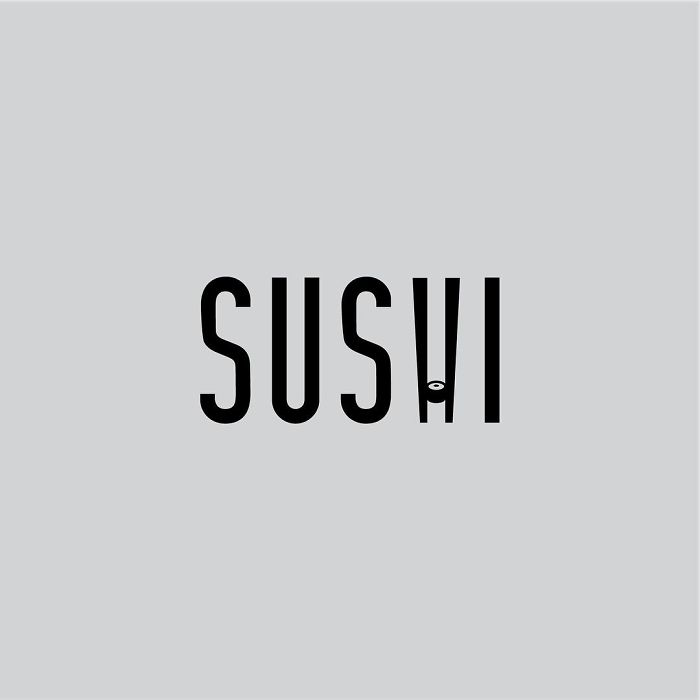
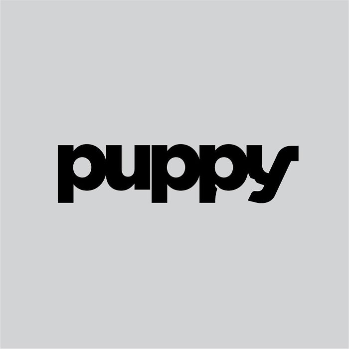
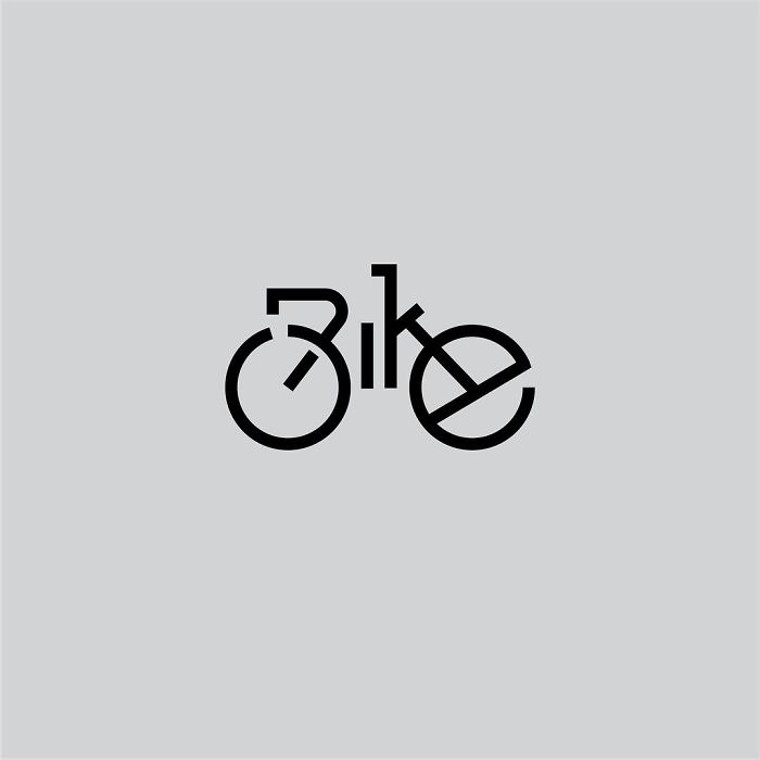
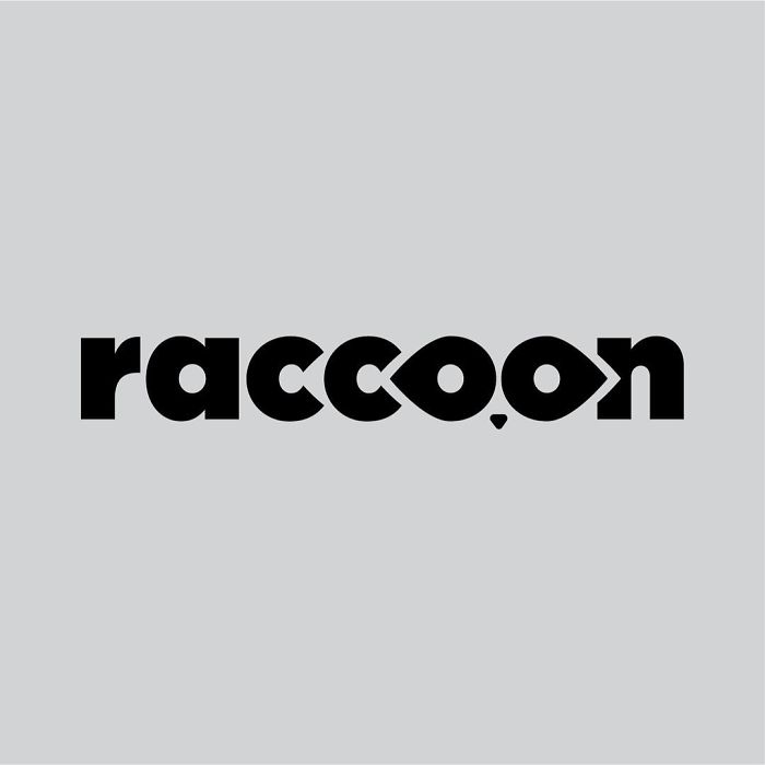
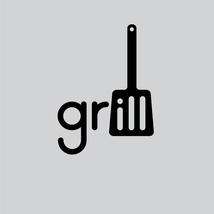
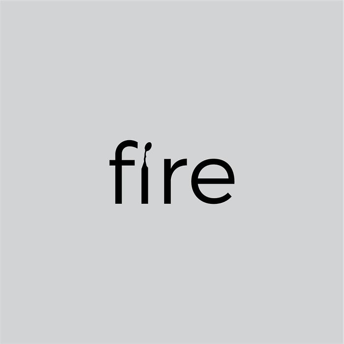
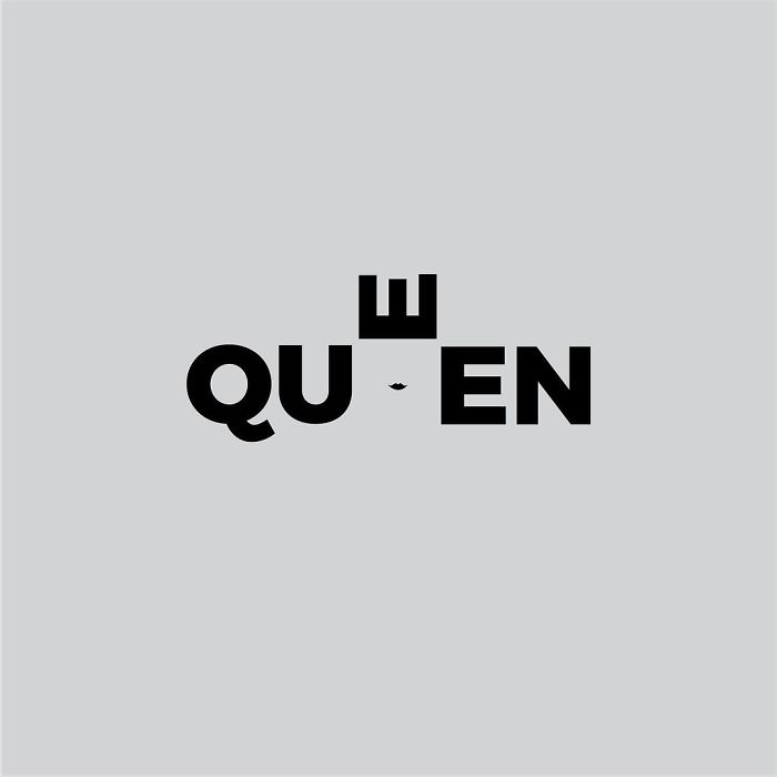
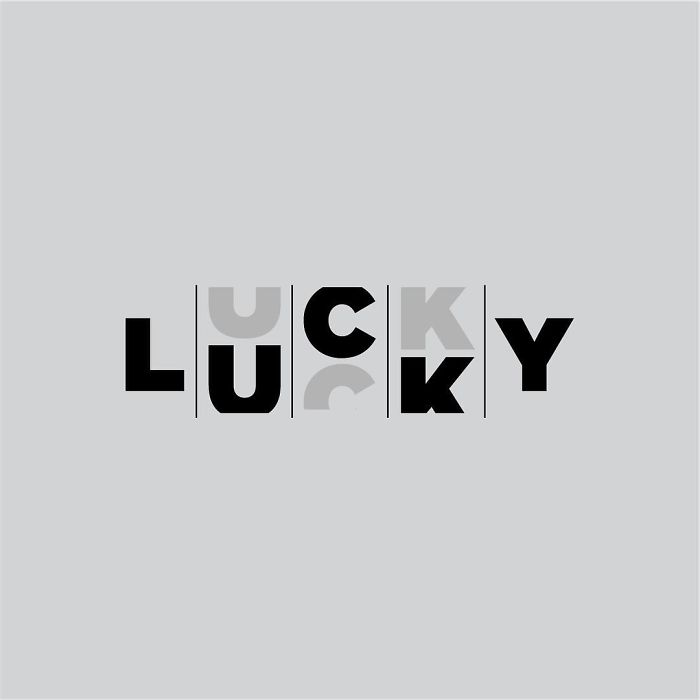
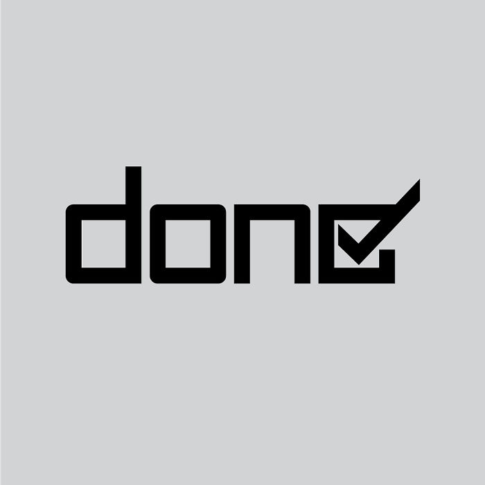
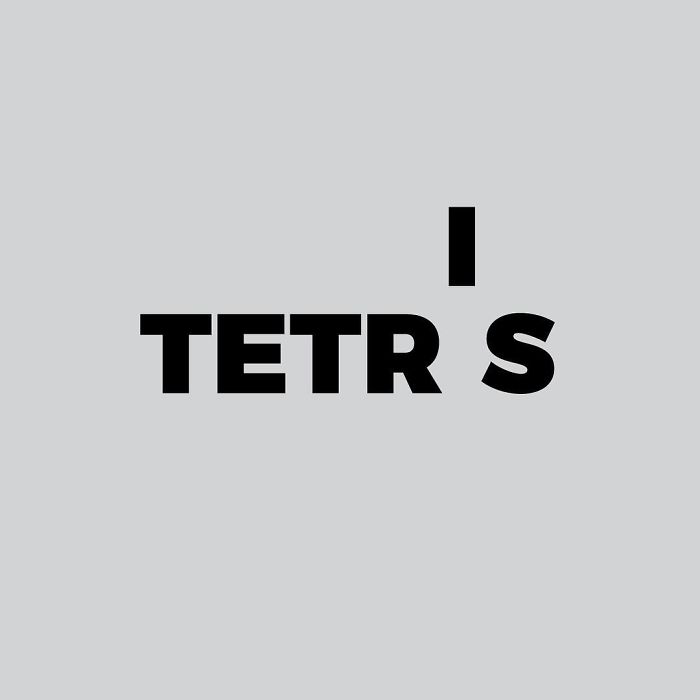
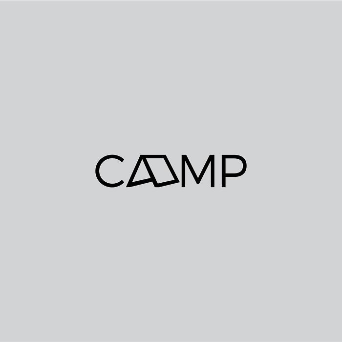
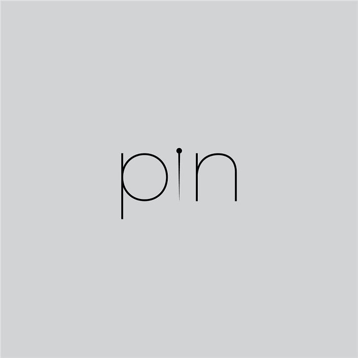
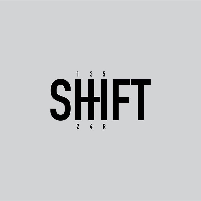
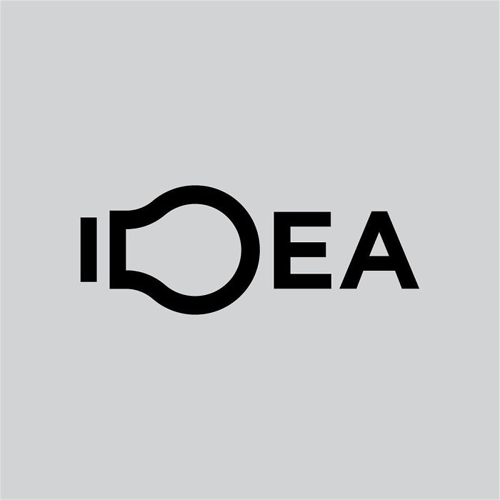
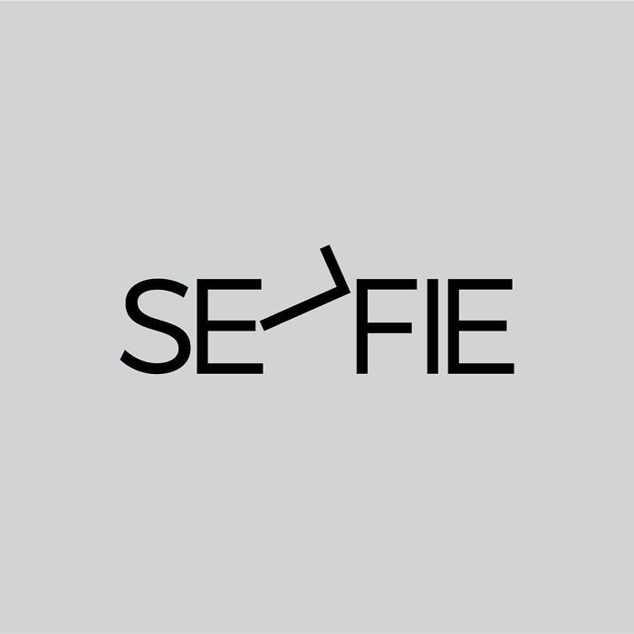
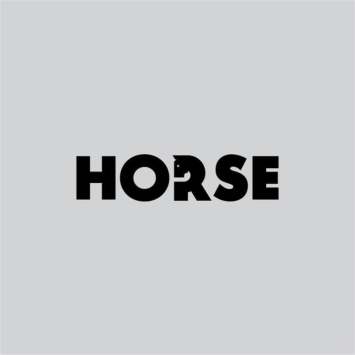
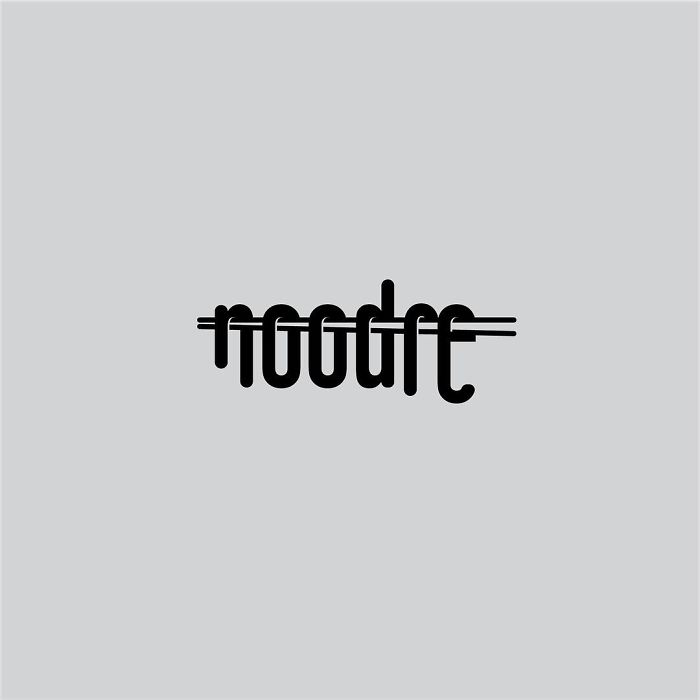
Swedish graphic designer Daniel Carlmatz also loves to get creative with words but in a different way. He set himself a challenge to create a new typographic logo design each day for 365 days, using a common word and adding related visual elements through symbolism, creative use of negative space, and geometry. The inspiration for the 365-day challenge came from trying to challenge myself to look at type and design from a different perspective, Daniel told Bored Panda. The challenge was just an outlet for my personal, minimalist design thinking. And yes, I did manage to finish it without missing a day!
The logo ideas are truly remarkable in their creativity and simplicity, proving that inspiration for the design is all around us. For Daniel though, the process was anything but simple. I struggled, he told us. I didn't want them to take up too much of my time so I used to do them in my head or sketch them down on my way to work, and then finalize them on my way home from work. But sometimes you just end up with nothing.
"I had a few words I felt I wanted to do, but a lot of the design ideas came from having a solution first - and trying to find a suitable word that could support it. One of the hardest words was Panda, which was with me from day one but wasn't published until day 251."
Some of Daniel's logos make you look twice before you make the connection, and are a lot of fun to try to find. Can you spot them all? Scroll down to check out his work for yourself, and let us know what you think in the comments!
More info: Instagram
(h/t: Digital Synopsis)
This post may include affiliate links.
These are very well done, but most are really more along the lines of visual puns rather than logos. Perhaps something was lost in translation when the title was created?
Oh wow, you got me with that one. Totally had to look at it 3 times before I caught it.
all I see is that it's been chewed up a little??
Load More Replies...the people saying they don't get it, there's a dog shape between the p and the y at the bottom...
could have made a mate with the first p and u since the same elements are aligned
Ha. If you want to trigger my rage reaction, show me that symbol...
In my opinion, this is the most creative one out this list. Make no mistake though, all of these are awesome.
Agree! I'm surprised at how easy it was to see the word, when it looks so much like a bike!
Load More Replies...Reminded me of an illustration I saw years ago: https://flic.kr/p/cTY5rU
Reminded me of this illustration I saw years ago: https://flic.kr/p/cTY5rU
Number/nummer: +46739303824 Let me know if it's available!
They're not evil! They're cute, cuddly, and so adorable with their little hands taking treats!!
Load More Replies...I think "ill" stands out, which is unfortunately not a good word when food is involved.
"ill" is also an old slang term for good, cool, and other word that mean "good". "That's ill bro".
Load More Replies...Oh dear... I saw a hand flipping the bird, and now I can't get the image out of my mind!
Update: I see it! I finally see it! Thought you’d be pleased to know.
Load More Replies...Nope, this is way more effective. I imagine they tried that first though:
Load More Replies...It's nice, but not a new idea. I remember a competition in the German BILD [tabloid] in the 1970s, where people could send in their designs just like this guy is doing. Yeah I'm a party pooper...
I've seen a similar thing done with the name of the most famous search engine - I suspect that there's a score of way to visually pun this subject!
I saw a paw print at first, but was pleased to now see a moon.
Load More Replies...it only takes one tree to make a thousand matches, only takes one match, to burn a thousand trees.
Mine too. *shakes head from side to side violently in a weak asses effort to clear it*
Load More Replies...rrrrrr, rrrrrr, rrrrrr, DINGDINGDINGDINGDINNNG
Load More Replies...Pirates everywhere are going to be offended by this stereotypical design.
I love this! I would have kept the neg. space in the "P" black like an eye patch!
I thought that was a "G" at the end, and that's a completely different word.
My school's jazz band always get a t-shirt, and for the third year in the row, they used that idea of a saxophone for a J
Tetris isn't that simple - the 'I' should have been tilted by 90 degrees!
Damn, harsh critics much!?? No way in heck most people could be this creative. Especially day in and day out for a year.
It’s not that easy. I was a Graphic Designer for a famous candy company in Tacoma, Washington 7+ years, I worked on several of their product designs.
Load More Replies...it will more close to tetris when the " i " is formed from 3-4 cubes stacked vertically
So subtle that if I didn't know I was looking for it, I probably would have missed it
What's even more aesthetically pleasing is that there are three and a half letters on each side!
About the only time when a divorce gets everything split 50/50
Load More Replies...The letter “I” should be the splitting point to show how it is never 50/50.
You say IKEA like it's a bad thing
Load More Replies...The I should have been the selfie stick, then SELF would be in the picture.
Load More Replies...Watch again, the tail is the negative space on the neck! :)
Load More Replies...agree... maybe if the "l" were extended lower to give the connotation that it's a longer letter???
Load More Replies...Is this guy in public school or something? A kid doing this may be impressive but if its an adult this is just sad! Why would you publish this???
Can you link me up some logos or designs worthy or your approval so that I can learn the difference between good and bad design.
Load More Replies...I feel bad for people who do not see the words lol so simple and elegant
If noodle they could have just written the whole word with one lone noodle??
Try make some corporate or product words with it. Like windows, google, apple, sony, ferrary, BMW, nokia, chipotle, KFC, etc. And let's see how it works.
The first few j was thinking "these are cool" then after about four of them I realized it's basically one design done 100 different ways... A little variety would be nice
I know therse are just random words - but as an example of what he can do - say for a job interview in design and marketinging - it's perfect
Great Designs. Away from the conventional. Can I use any of them, or are they trademarked?
Please BP, I love your content, but enough with the "I Challenged Myself" c**p! How about just "Artist creates ______ every day..."

 Dark Mode

 No fees, cancel anytime