Once upon a line…
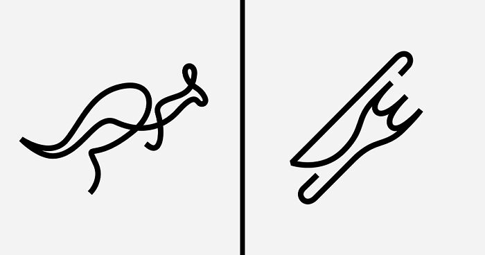
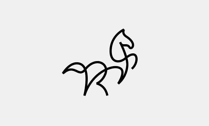
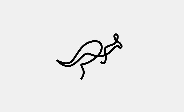
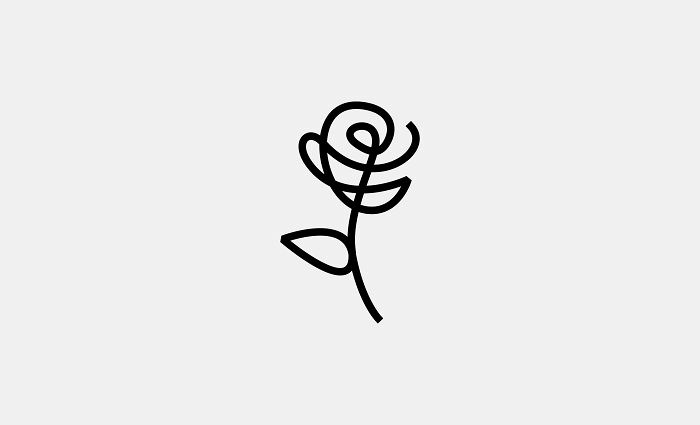
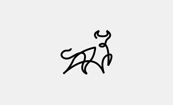
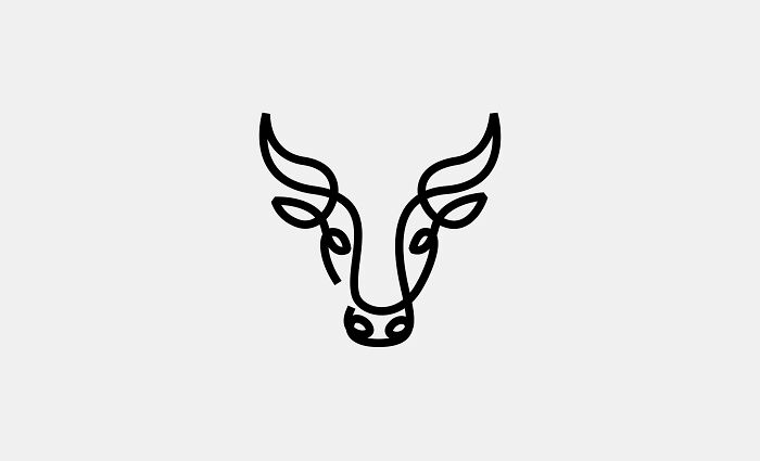
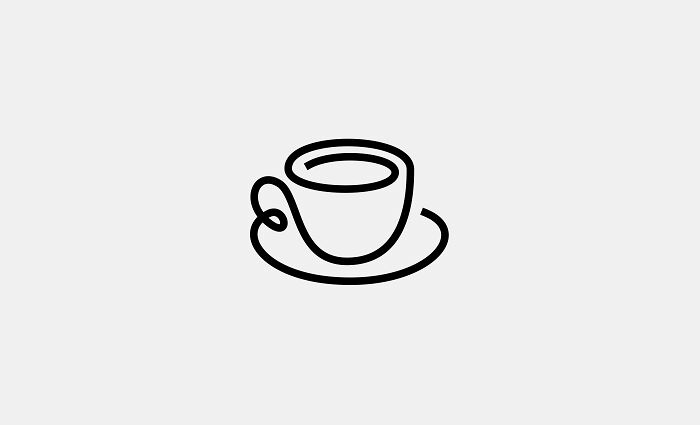
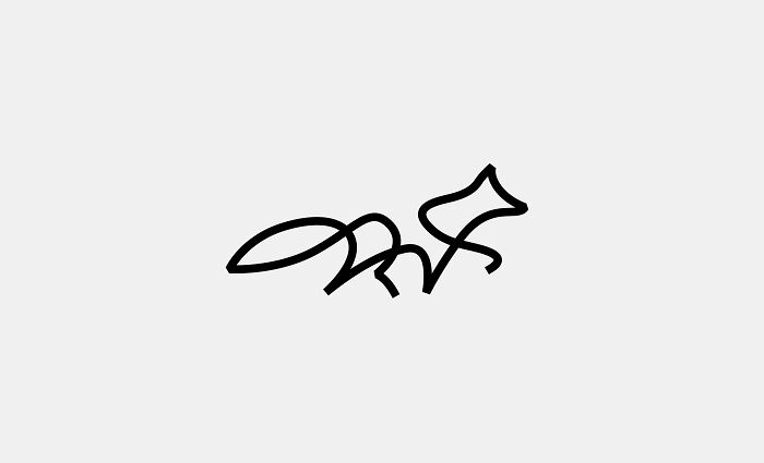
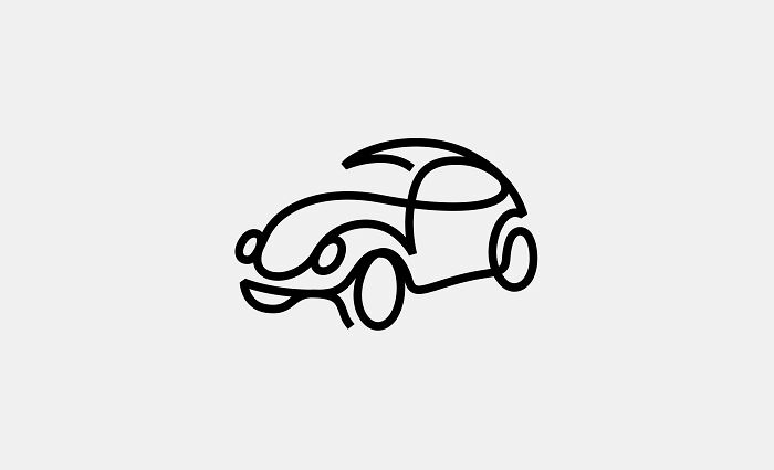
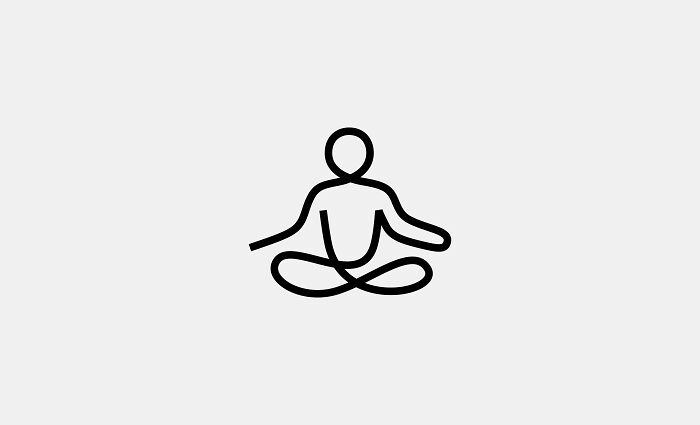
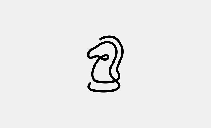
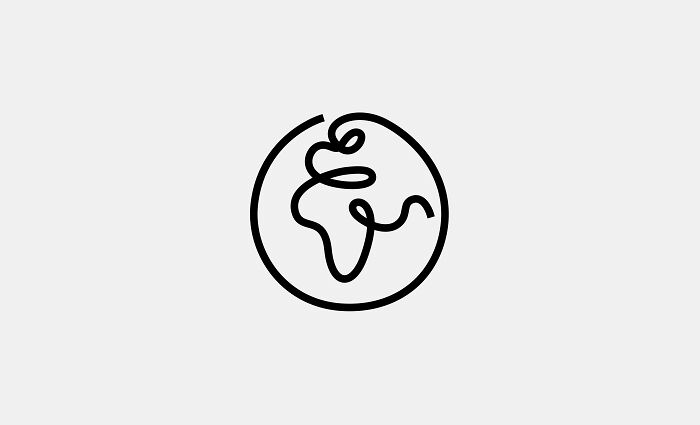
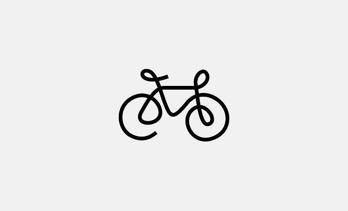
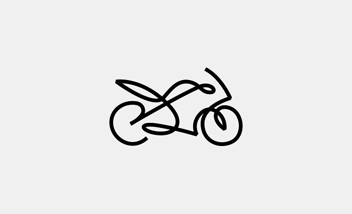
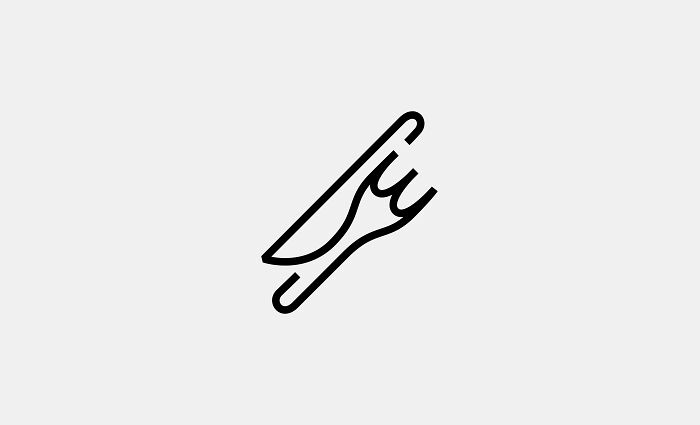
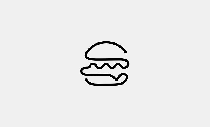
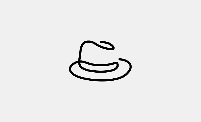
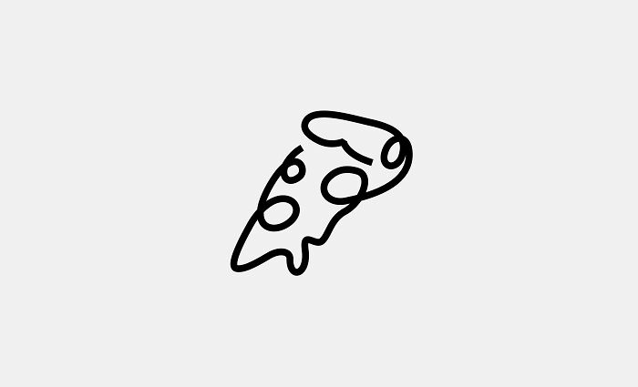
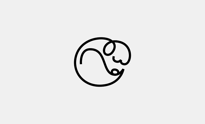
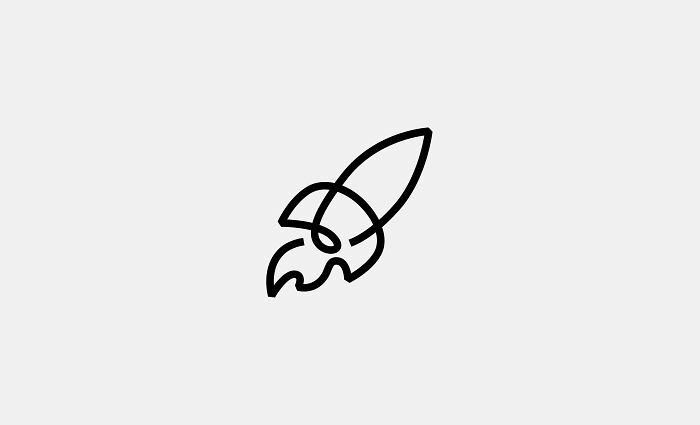
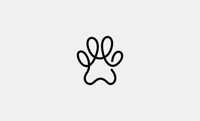
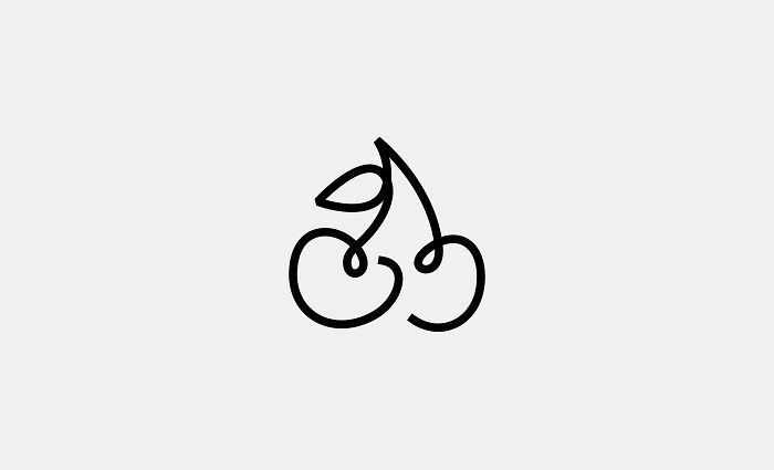
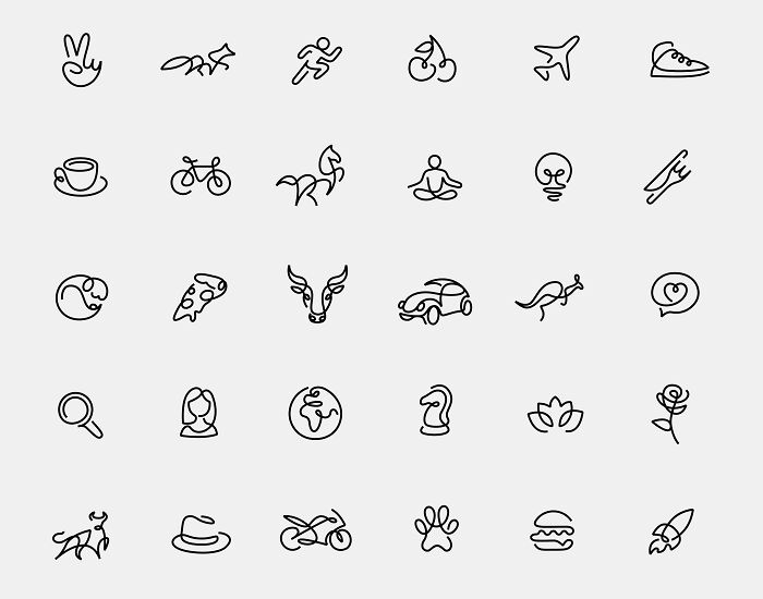
We embarked on a creative journey to design minimalist one-line logos that convey their essence in the simplest visual form. Inspired by the challenge of creating intricate designs with a single continuous stroke, we crafted 30 unique and figurative logos. This project is an exploration of how minimalism can transform complex ideas into iconic and impactful visuals.
Creating each logo can take hours of trial and error before finding the best one-line path. The goal was to highlight the power of simplicity and to show that less can indeed be more. We hope these designs resonate and inspire others to embrace the beauty in minimalism.
Thank you!
More info: loooop.studio | Instagram | behance.net
This post may include affiliate links.
We are a group of international artists who work in various creative industries, and we all share a passion for line art, particularly the style known as continuous line art. Our team came together in 2015, when our two French co-founders, Stephane and Emma, decided to turn their love of minimalism and line art into a professional endeavor.
We believe that there is beauty in everything and we try to capture the simple aesthetic with our continuous line constraint. People seem to enjoy this simple message (we receive a lot of photos with our designs tattooed on people) and there is also a playful dimension in which they like to guess what the drawing is at first sight.
With our distinctive style, we try to capture the unique beauty of the design. We hope you’ll like it and appreciate this ‘less is more’ moment.
While creating, it’s very pleasing to play with the lines and the white spaces until you’re happy with the artwork. The result looks simple but it’s indeed quite a challenge to achieve and depending on the subject, a single drawing can take several hours… or days!
We love to hear from the people of our community, they always suggest that we draw unexpected things.
If you like our drawings, see you tomorrow on Instagram for a new line!
I like the concept, it seems a hard work behind. And i don't know why so much hate in the comments, or i'm missing something? Even the @ with a heart is easy to catch. Or maybe The word logo was taken as "brand"?
I like the concept, it seems a hard work behind. And i don't know why so much hate in the comments, or i'm missing something? Even the @ with a heart is easy to catch. Or maybe The word logo was taken as "brand"?

 Dark Mode
  No fees, cancel anytime