Typography is not just picking out a letter font and typing away; there is a whole system and a bunch of specific terms behind it. For example, a professional working with typography might use such terms as leading, kerning, foot, vertex, crotch and swash on a daily basis. Now, we are not going to drown you in stiff scientific language explaining all that, but rather show you what one of these words, kerning, means.
If you'd to check a dictionary, you'd find that kern might mean a yokel, but that's not the meaning used in typography. Kerning basically describes the horizontal spacing between two consecutive characters used in a font. When type was printed using cast metal, parts that needed to overlap adjacent letters hung off the edge. Computer typefaces might have manual, automatic, or no kerning whatsoever for every different font styles; no kerning can make it appear that there is a space between letters, while automatic kerning produces mixed results.
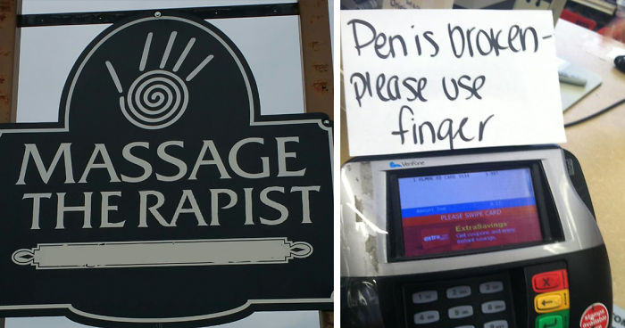
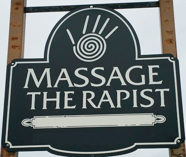
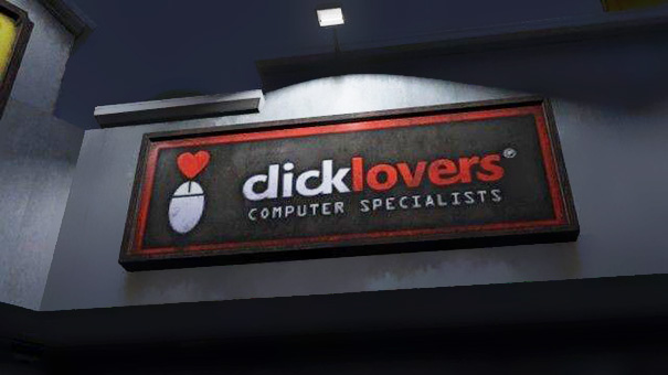
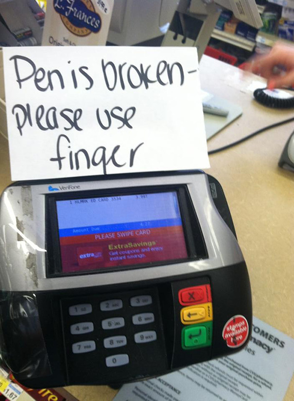
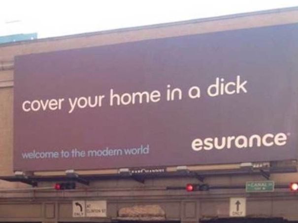
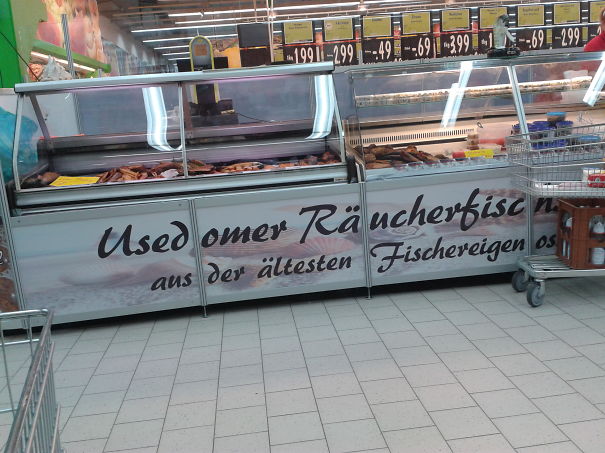
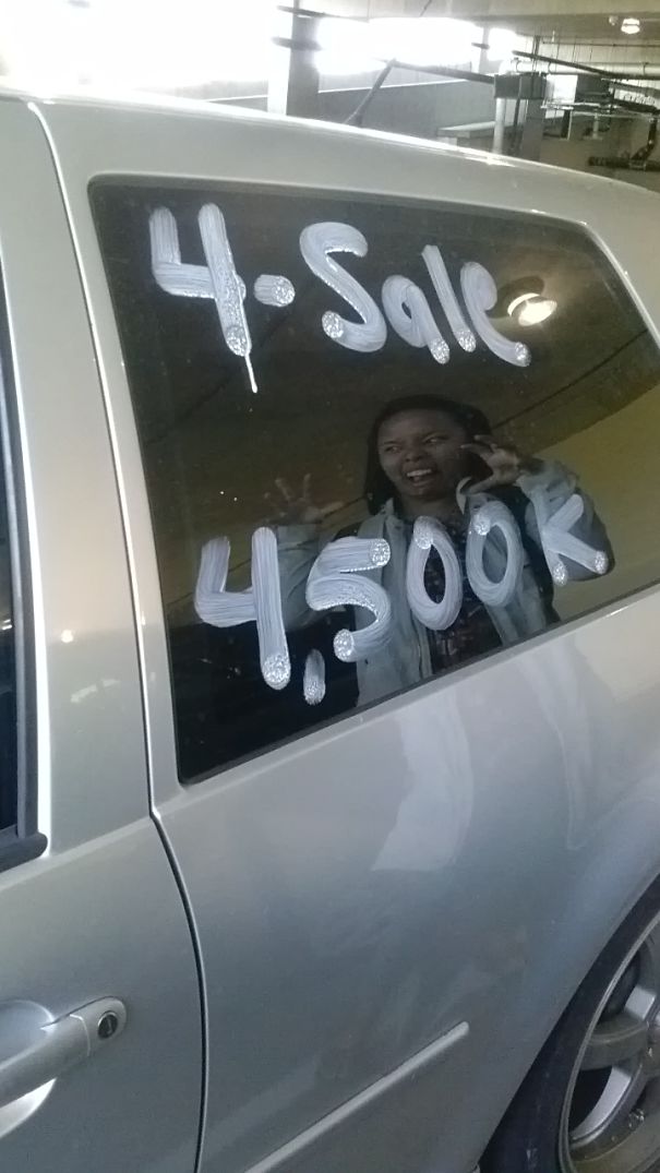
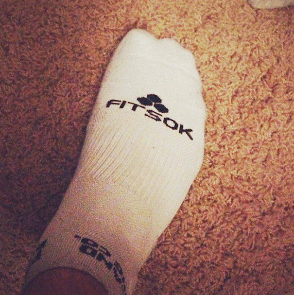
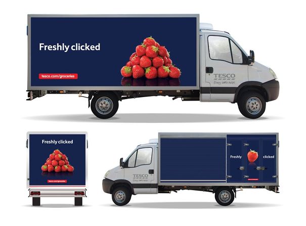
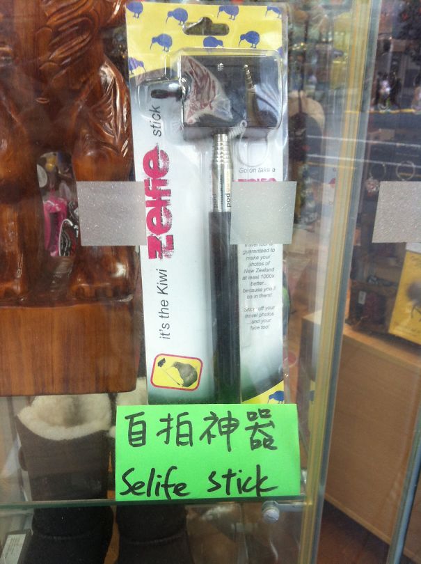
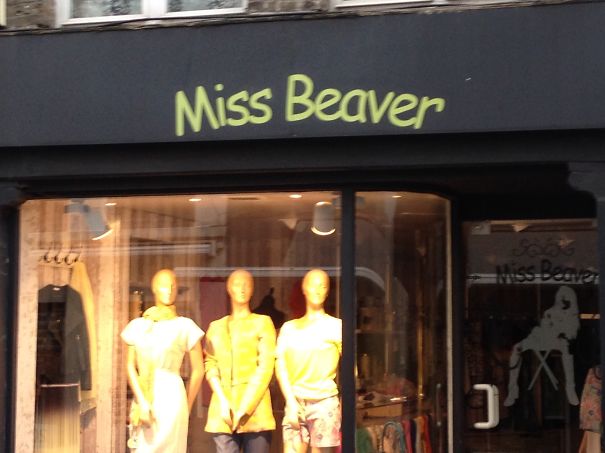
Still wondering why letter spacing is so important? Well, typography design fails can ruin (or make hilarious) even the best thought-out text, as the examples below demonstrate. It turns out that there is only a few millimeters difference between 'clicks' and 'dicks,' 'therapist' and 'the rapist.'
Scroll down below to see these funny fails and more for yourself!
This post may include affiliate links.
What Style Of Massage Is This?
Another Reminder That Yes, Fonts And Kerning Matter
I'm Sorry, What's Broken?
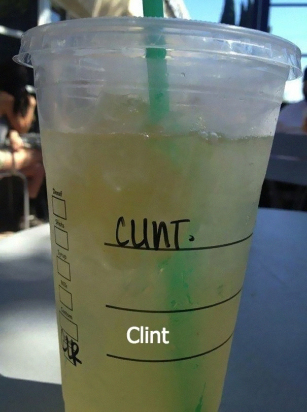
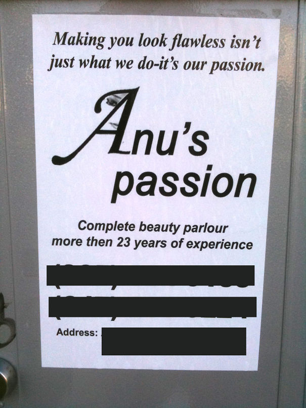
Badly Misspelled Name
I wonder how the worker would call him after the beverage is ready to serve.
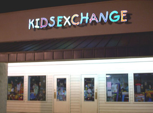
Spacing Is Important
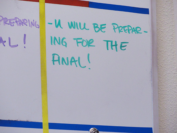
My Math Teacher Also Taught Us The Importance Of Kerning
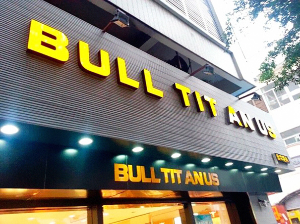
Bull Titan Us
Space Bar, You Had One Job
Why was Donald Trump the first person I thought of when I read that sign?
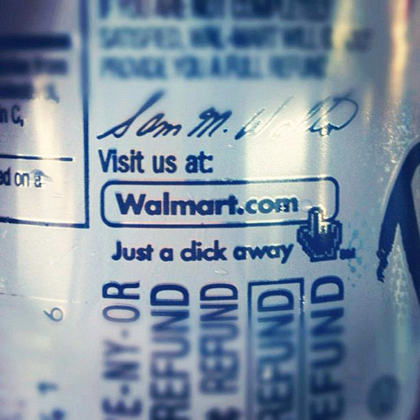
Hey Walmart... Kerning Is Important
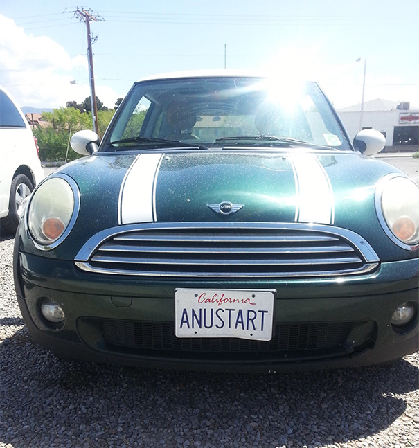
Worst Tart Ever
Bad Kerning, Good 'shrooms
Well, if you think about where mushrooms grow, it's not that far off.
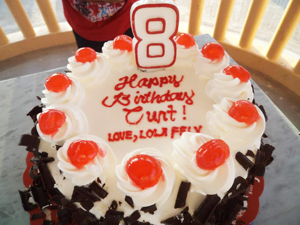
My Aunt In The Philippines Made A Nice Birthday Cake For My Relative Curt
That's a cursive lowercase "r", sorry kids, doesn't look like an "n" ... do they even teach cursive anymore (some one called it old font, lmao, cute) ?
Sign Above The Megaflicks Store
Maybe They Should Pick A Different Font Next Time
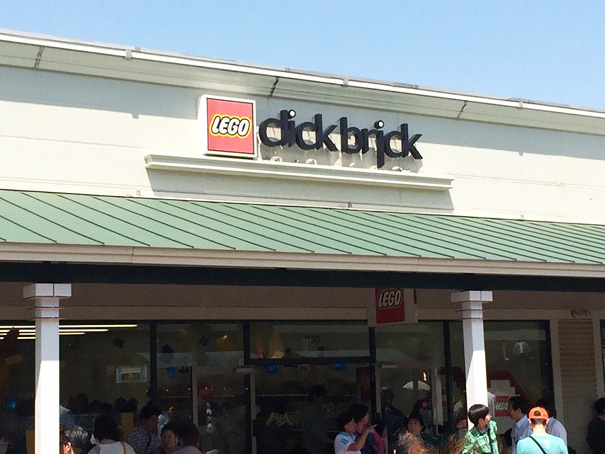
Lego Click Brick
Ooh Errr
Lightpost In The Way = Very Awkward Abbreviation!
In the Commonwealth, "a*s." is association, "a**e" is the posterior. So this is only funny to Americans and some Canadians.
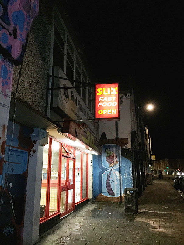
Fast Food
Somehow I'm Not Surprised They Went Out Of Business
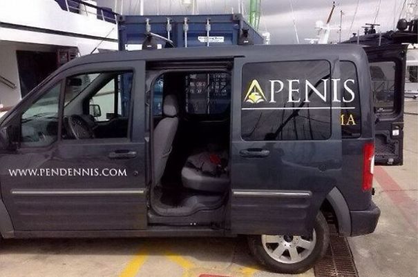
Falmouth Based Company Pendennis... Getting In Wrong
It's not the "I" photoshopped, as Marcia says, but part of the "D"
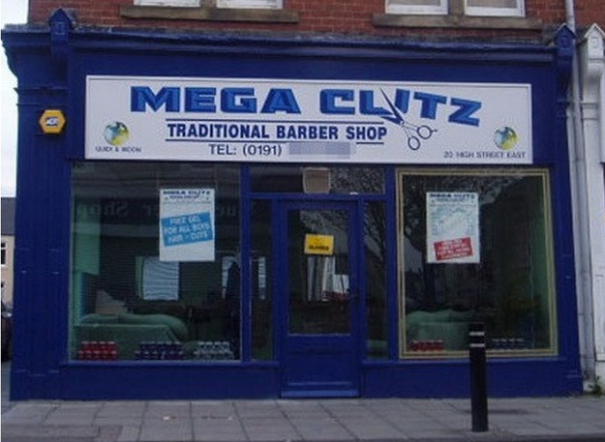
A Traditional Barber Shop
Letter Spacing Can Make All The Difference
think the employee that posted the letters for this sign was trying to pull a "fhritp"?
Erm? No Thanks..
Wtf? What Does This Asian Restaurant In Germany Offer?
An Asian Restaurant supposedly in Germany........... that writes in American /English
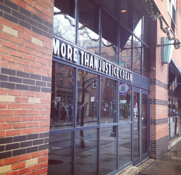
For Those Whose Needs Go Beyond Justice Cream Alone
They Pay You To Buy Them!
A Test Image
It appears you are going to get a 150% discount instead of 50%. I think it said Buy 1 get 1 fifty percent off. but the 50% was too close to the 1. so not only was it free they were going to pay you half more to take it. haha.
Load More Replies...It appears you are going to get a 150% discount instead of 50%. I think it said Buy 1 get 1 fifty percent off. but the 50% was too close to the 1. so not only was it free they were going to pay you half more to take it. haha.
Load More Replies...
 Dark Mode

 No fees, cancel anytime


