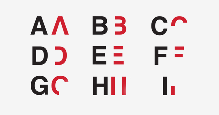
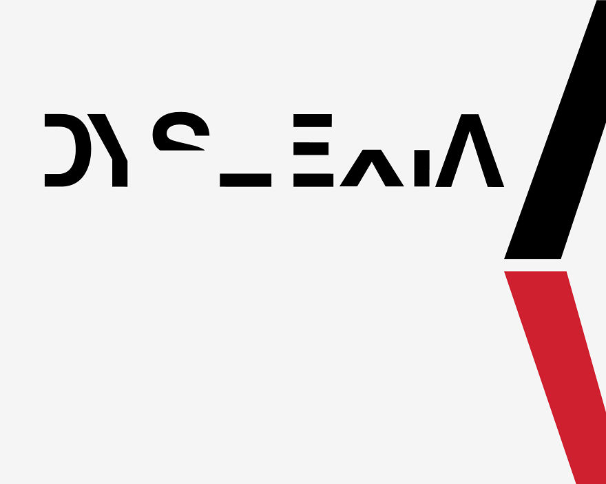
Dyslexic Typeface: I Created A Font To Show How Hard It Is To Read For Dyslexics
I am Daniel Britton, a creator of the “Dyslexic Typeface”. I have always thought this was a strong piece of work but I had no idea it would receive so much attention in such short time.
The project itself is about creating awareness of dyslexia, I did this at University (The London College of Communication) as a self-incited project. As I am dyslexic, I saved some hours on the research stage. My problem with dyslexia is that it is a greatly misunderstood topic, there is no understanding of the condition.
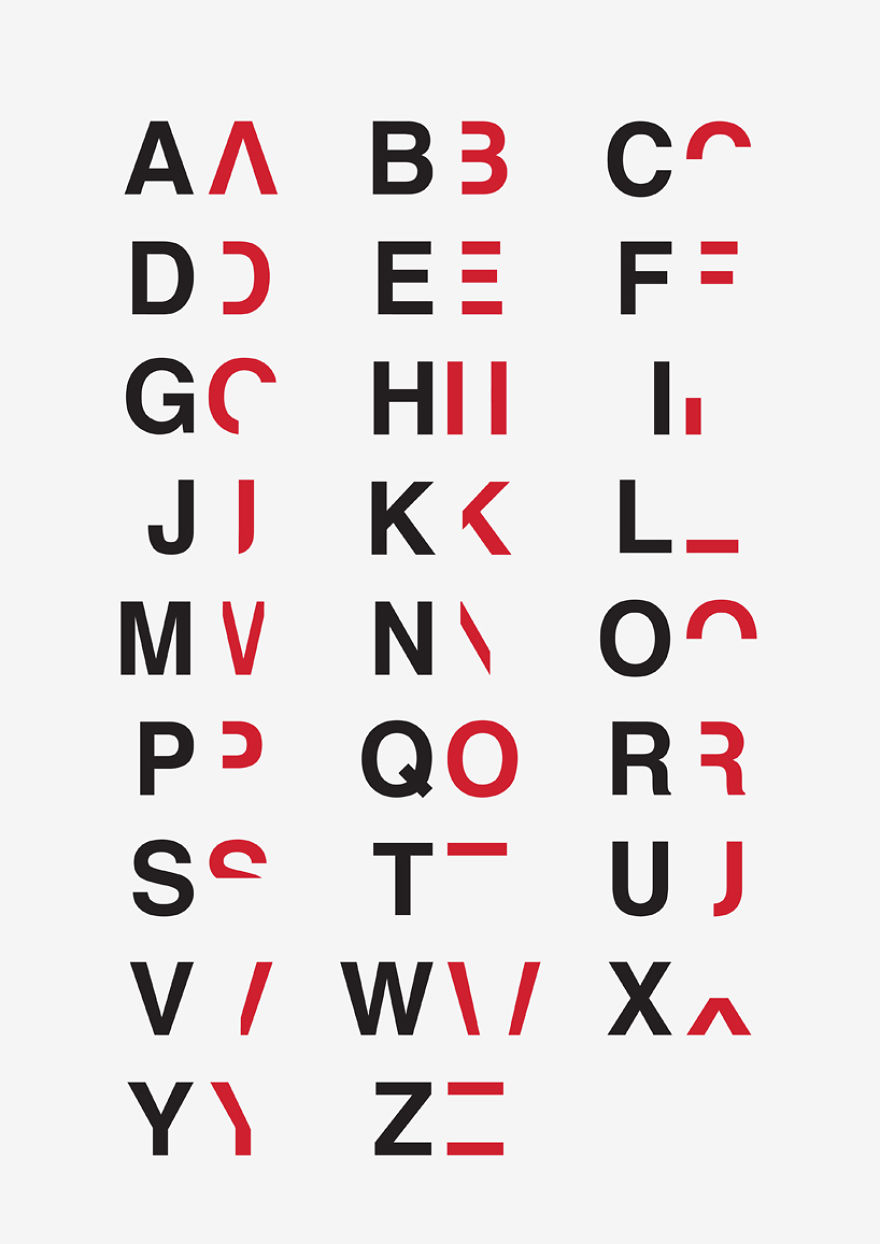
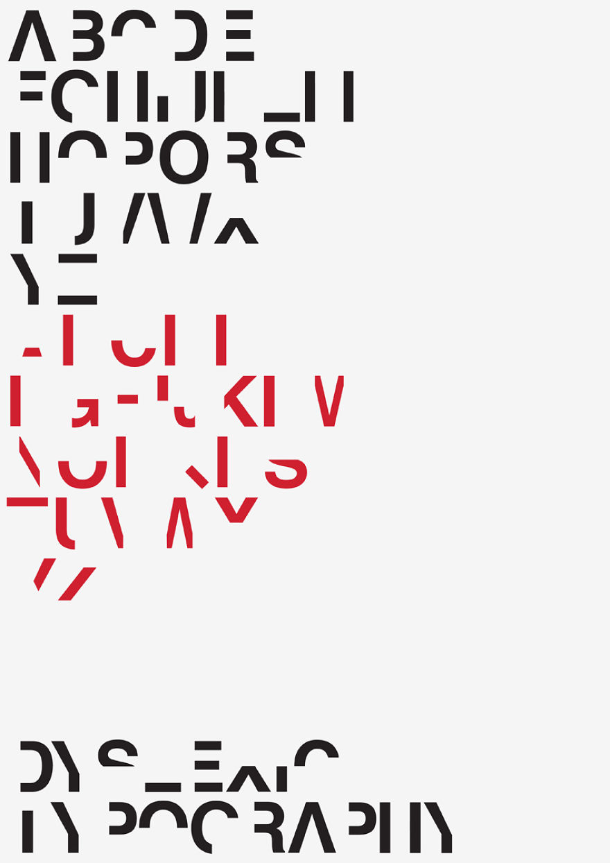
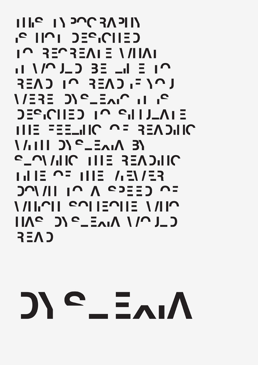
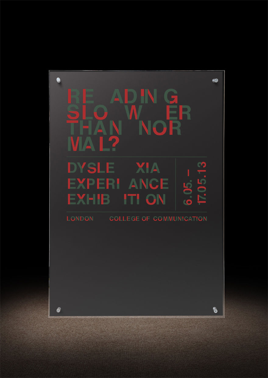
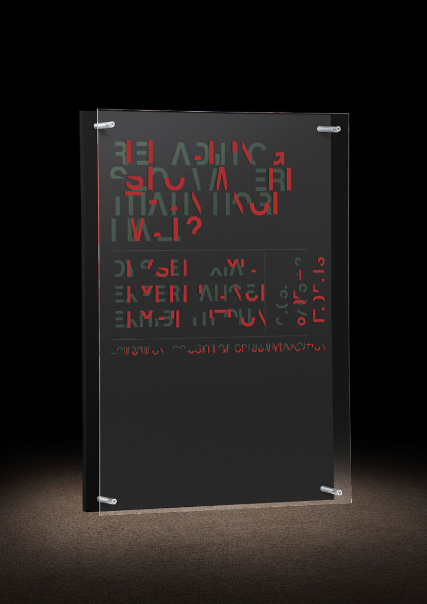
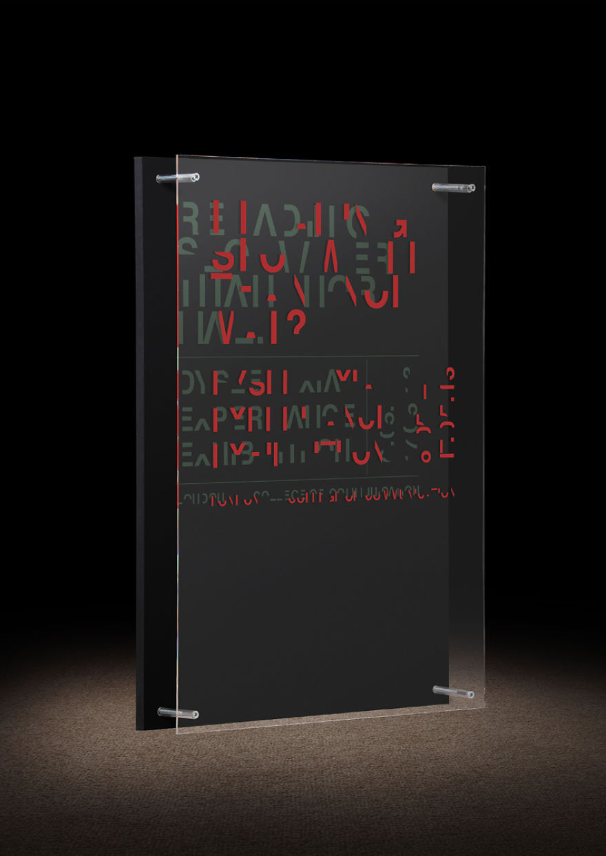
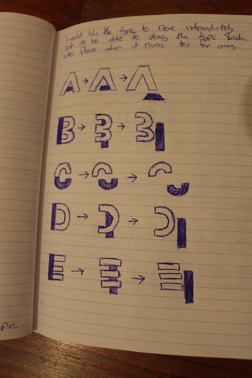
All of the existing material was and still is very basic, it didn’t convey any emotion so I wanted to recreate the feeling of reading with dyslexia, to try and put someone else in our shoes. Therefore, I created a typeface that would be almost illegible so that it would slow down the reading pace of a non dyslexic person to the speed of a dyslexic and in return recreating the frustration, the embarrassment of reading with the condition.
When I first done the piece I was happy with it. When I showed it to a few friends they looked at it and they were like “Ahh I get it now.” After all of these years of trying to explain myself, I show a poster and it does the work for me, I was so happy people were finally getting it.
So now as it is still gaining media attention I am getting more and more requests for information, how to over come it? How do you deal with it? What is it? So I have decided I am going to create a Dyslexia Awareness educational pack to send out to schools on request that will educate the parents and the teachers on what the issue is and how best to treat it.
More info: danielbritton.info
3D Experience
3D Experience Side On
That’s me!
44Kviews
Share on FacebookBecause they have so much less information than lower case, any text set in all caps is harder for everyone to read. It takes more attention and slows comprehension. That's why monuments and headlines are set in all caps, but books and newspapers are not. So while choosing to design an all upper case font makes sense because it is less legible from the get-go, that same fact qualifies its approximation of dyslexia, because the letter forms are so very different from the ones we actually read every day.
thank goodness someone finally sees words the way that I see them!!
Because they have so much less information than lower case, any text set in all caps is harder for everyone to read. It takes more attention and slows comprehension. That's why monuments and headlines are set in all caps, but books and newspapers are not. So while choosing to design an all upper case font makes sense because it is less legible from the get-go, that same fact qualifies its approximation of dyslexia, because the letter forms are so very different from the ones we actually read every day.
thank goodness someone finally sees words the way that I see them!!

 Dark Mode

 No fees, cancel anytime

































118
18