
20 More Creative Product Packaging Examples
We are frequently taught not to judge a book by its cover, but in sales, beauty is often skin deep and cool design always wins. The first impression is created by the product packaging, and sometimes it’s all it takes for us to want it. Just think about it, how many times you bought some useless stuff just because it was in creative packaging?
Originally packaging was meant to contain, protect and transport goods, but later the producers started to grasp the power of good design as well. Today looks matter more than ever before and often push us into rushed decisions. How many of you could you resist these creative design examples we posted earlier?
So think twice before buying just because of the clever design of the package and read the labels carefully. Here are 20 more examples of dangerously creative ideas concerning product packaging.
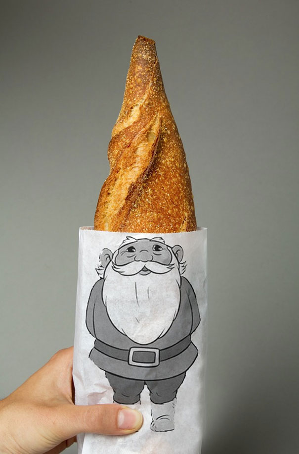
1. Gnome Bread Packaging
(Designer: Lo Siento Studio)
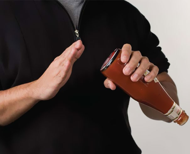
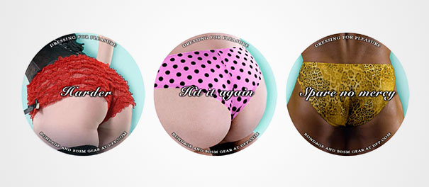
2. DFP.com : Harder
“There are two worlds of bottom smacking, the world of BDSM and the world of ketchup bottles. The company, Dressing for Pleasure, a specialist in fetish wear and all things S&M related, married these two worlds by putting stickers of enticing rear ends on the bottoms of ketchup bottles. Thus inviting bar patrons to explore a completely different appetite while addressing their hunger.” (Advertising Agency: JWT, NY, USA)
3. Fit Buns High Protein: Bread
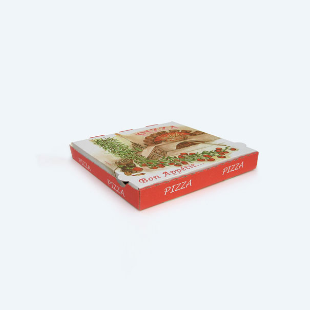
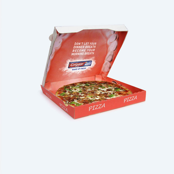
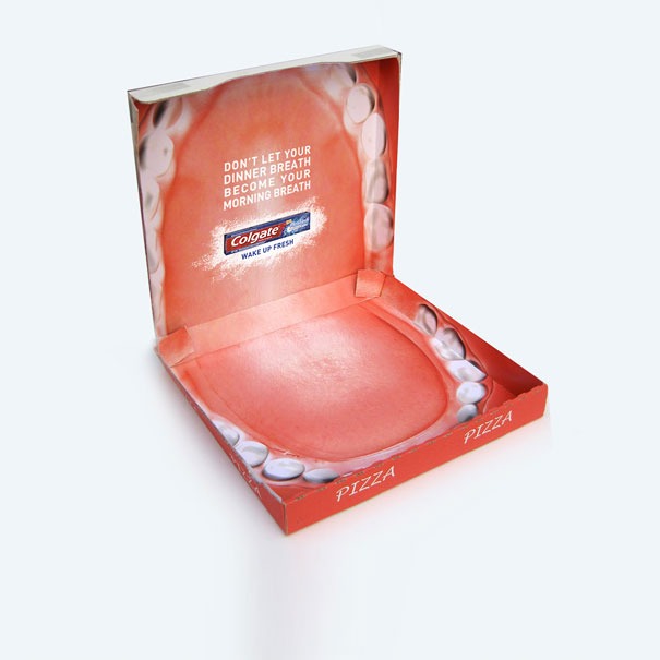
4. Colgate Max Night: Pizza Box
“To promote the new Colgate Max Night variant local pizzerias were supplied with special Colgate-branded boxes for their dinner deliveries. The inside of the box was designed to look like the inside of a mouth. The message reminded people to use Colgate max night so their dinner breath does not become their morning breath.” (Advertising Agency: Y&R, Paris, France)
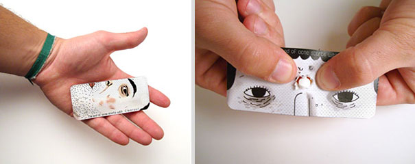
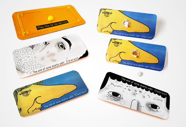
5. Clearasil: Squeeze
“Clearasil is a pharmaceutical gel designed to fight Acne, widely used by teenagers on puberty. Its image is very strong near this target but not so strong among general practitioners.” (Advertising School: Hambre, Leo Burnett Lisbon School)
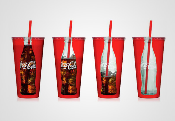
6. Coca-Cola Cups
(Designer: unknown)
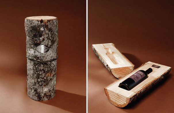
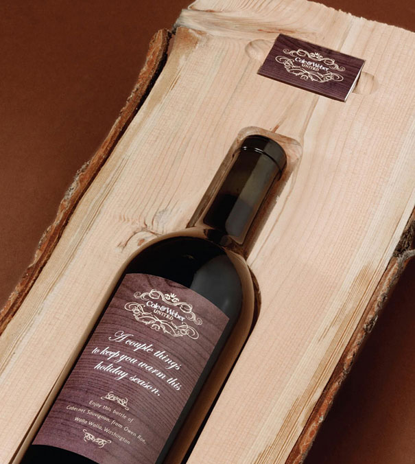
7. Cole & Weber United: Holiday Log
“What better holiday moment than settling in with a bottle of wine and a warm fire in those cold, long months? We took logs of fresh pine and milled them to hold a wine bottle and a box of customized matches. Inside the log was a cheerful greeting and instructions on how to properly enjoy the gifts. Not only did we create a great shipping container for the wine, but that container was the backdrop for a great holiday experience that could last beyond its opening.” (Advertising Agency: Cole & Weber United, Seattle, USA)
8. Origami Beer
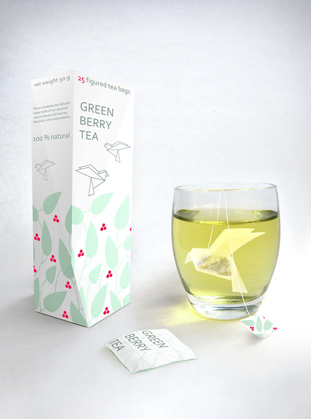
9. Green Berry Tea
(Designer: Natalia Ponomareva)
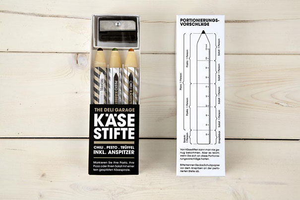
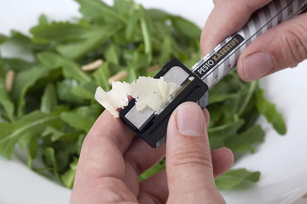
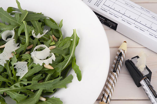
10. Parmesan Pencils
“Take the Parmesan Pencil, sharpen it using the enclosed sharpener, and you have delicious, fresh Parmesan cheese on your meal. There couldn’t be an easier way to decorate your pasta & co. And the packaging also plays a central role: Using a scale on the pens and on the back of the packaging, it’s not only easy to tell how much grated Parmesan Pencil you need for each dish, you can even see how many calories each serving contains. So kitchen craftsmen have everything perfectly under control.” [1] (Advertising Agency : Kolle Rebbe / KOREFE, Hamburg, Germany)
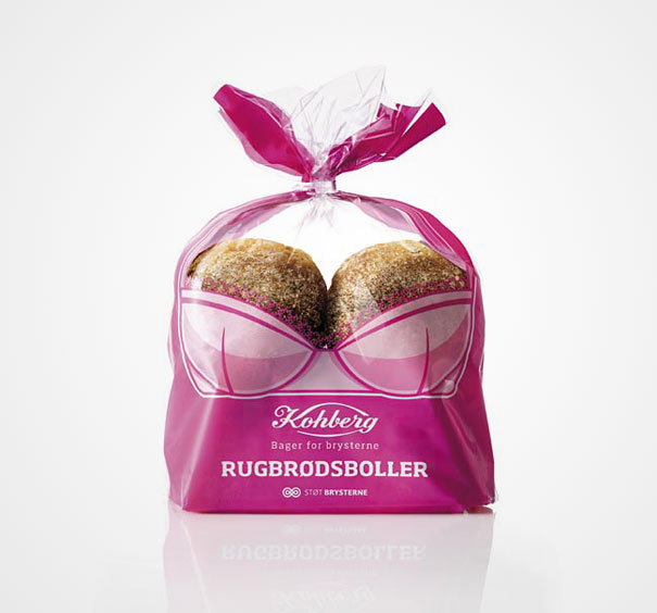
11. Kohberg, “Support the Breasts” Bread Packaging
“Kohberg, the largest manufacturer of bread in Denmark, is the proud sponsor of The Danish Cancer Society in their big annual event to fight breast cancer.The event is called ‘Support the breasts’ and Kohberg donates part of the revenue generated from sales of rye bread buns (Rugbrødsboller). The brief from Kohberg was to come up with a packaging idea to increase awareness and sales.” [2] (Advertising Agency: envision)
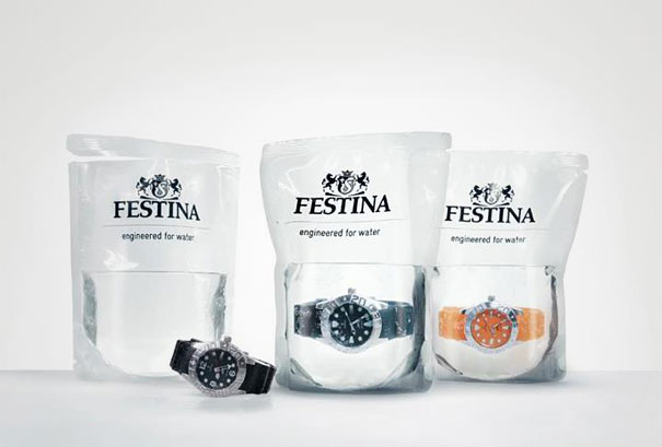
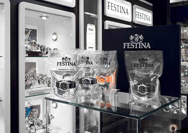
12. Waterproof Watches Sold in Bags of Water
“We believe in what we can see: the maximum transparency of the packaging design shows the absolute confidence we have in our product. That’s why we submit the Festina Profunda to quality control directly at the point of sale: the watch is presented in a transparent bag filled with distilled water. In subjecting it to this visible test of endurance we can convince the customers of the watch’s outstanding quality.” [3] (Advertising Agency: Scholz & Friends)
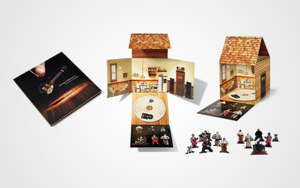
13. Vonnegut Dollhouse: CD Packaging
“Vonnegut Dollhouse is one of the newest forces in Vancouver’s independent music scene.” (Advertising Agency: Rethink, Canada)
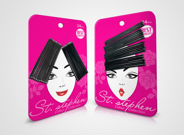
14. St.Stephen Hair Accessories
“In today’s haircare accessories market the level of competition is high. For a brand to standout from the crowd, it needs to be unique and able to differentiate itself from the competition. St. Stephen is a brand new hair accessories line carrying products such as bobby pins, elastics, hair pins and head wraps. The most popular products are bobby pins and elastics. The principal of this collection set is to use packaging design and simple arrangement to appeal to different segments of consumers. Matching the functionality of bobby pins and elastics with design characteristics that resonate with the target market generates a huge impact on the shelf and make a sale more likely.” (Designer: Prompt Design)
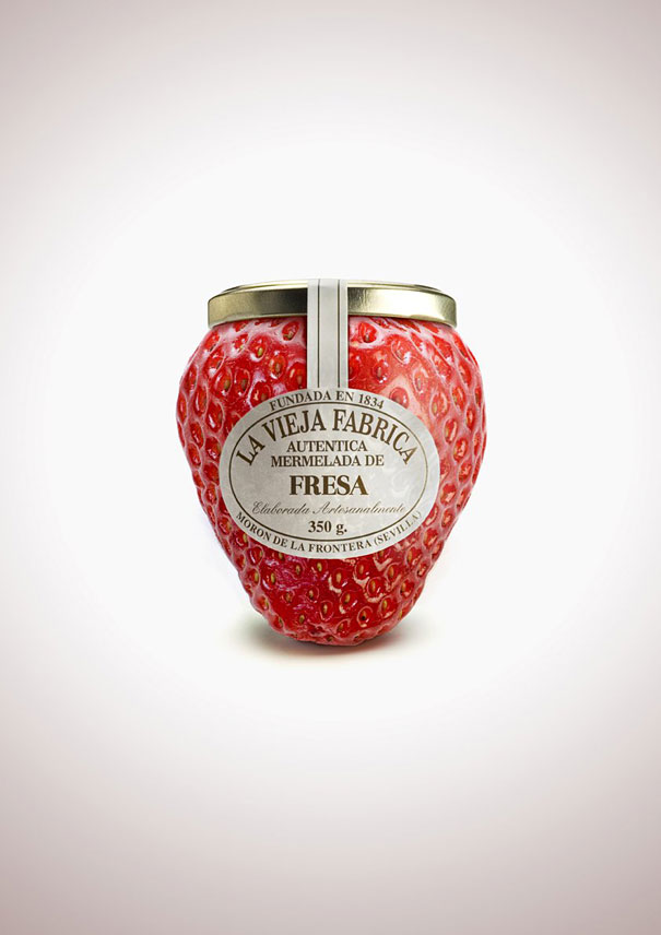
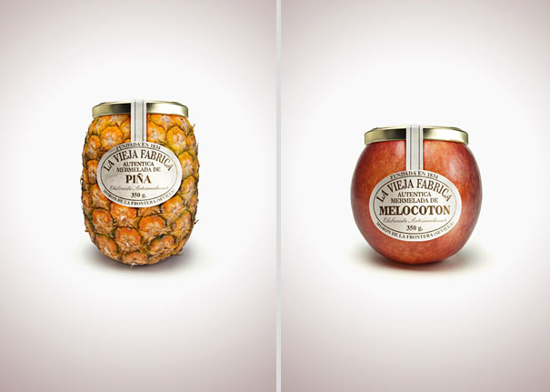
15. Fruit-Shaped Jam Bottles
“Fruit-Shaped jam bottle advertising manipulations for La Vieja Fabrica.” [4] (Advertising Agency: tapsa)
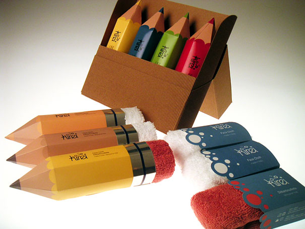
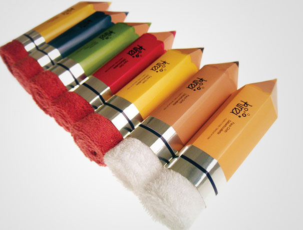
16. Kirei Towel
“Towel’s purpose is to clean. To expand its strength, the towel is packaged in a pencil, acting as the “eraser” as part of the pencil. They can be sold as individuals or as a pack of colourful pencil crayons! Let’s erase the blemishes on your face!” (Designer Hannah Jor)
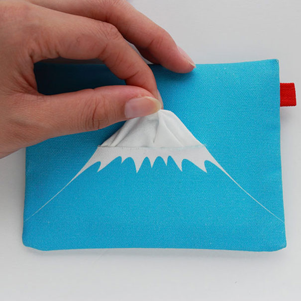
17. Mount Fuji Tissue Holder
(Designer: Tomohiro Ikegaya)
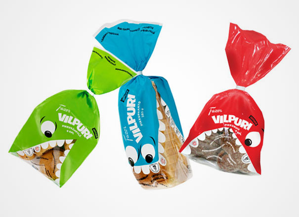
18. Fazer Vilpuri
(Designer: Hasan and Partners)
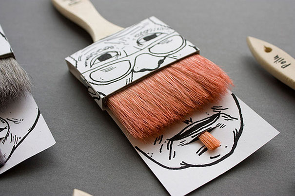
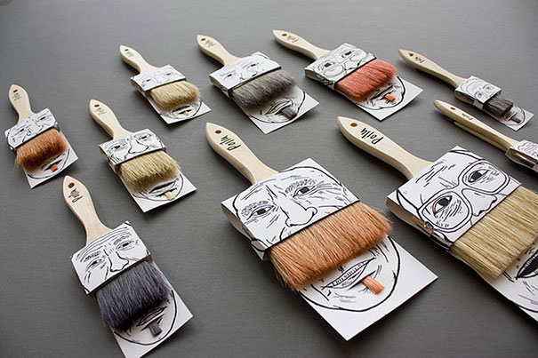
19. Moustache Paintbrush Packaging
“This humoristic packaging offers the function of assembling two products (two paintbrushes) together with only one cardboard printed on both sides.” (Designer: Simon Laliberté)
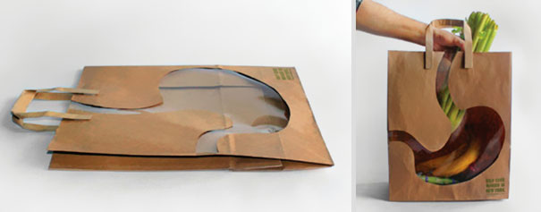
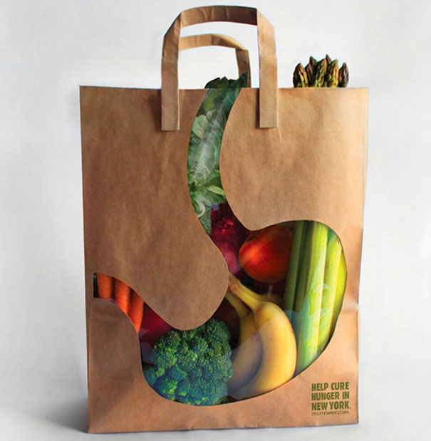
20. “City Harvest” – Empty Stomach Bag
“The benefit of City Harvest is demonstrated as the empty stomach bags are filled with food. The bags are supplied to supermarkets, grocery stores, etc.” (Designer: Andy Winner and One Show Merit)

 Dark Mode

 No fees, cancel anytime



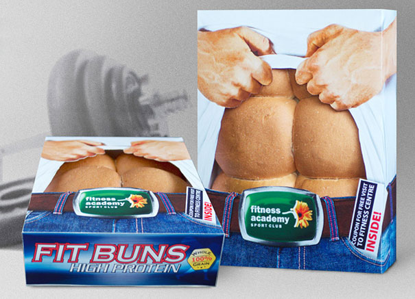 “We got into cooperation with bakery that supplies bread to neighborhood stores. Together we created FIT BUNS — a branded healthy buns with coupon for a free visit to fitness center inside the box. Results:2996 packs of buns sold the first month. 658 people came for a trial session, 217 purchased membership cards. That increased the number of fitness center clients by 25%. FIT BUNS sales generated 115% return on investments.” (Advertising Agency: MEX, Ukraine)
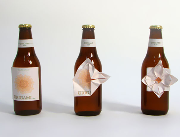 “Pre-folded origami beer label. It is a common phenomenon that people, in nervous situations, scratch off the label of their beer bottle. Origami label is about making something constructive out of this situation. If you follow the indications on the label, you can fold it into a flower.“ (Designer:














25
18